Key takeaways
- Format: Floating product pattern framing a centred offer box.
- Best for: DTC and supplement brands running first-order or launch discounts.
- Hook: A bold '25% off your first order' offer.
- Reuse it: Scatter your product around the edges and put the offer in a high-contrast box.
Available sizes
What is an offer ad?
An offer ad leads with a deal, such as a percentage off, free shipping or a first-order discount, as the main hook. It's built to convert people who already know the brand or are close to buying, and works best with a clear deadline or condition.
See all offer / discount ads →Why this offer / discount ad works
- 01
Product repetition builds recall
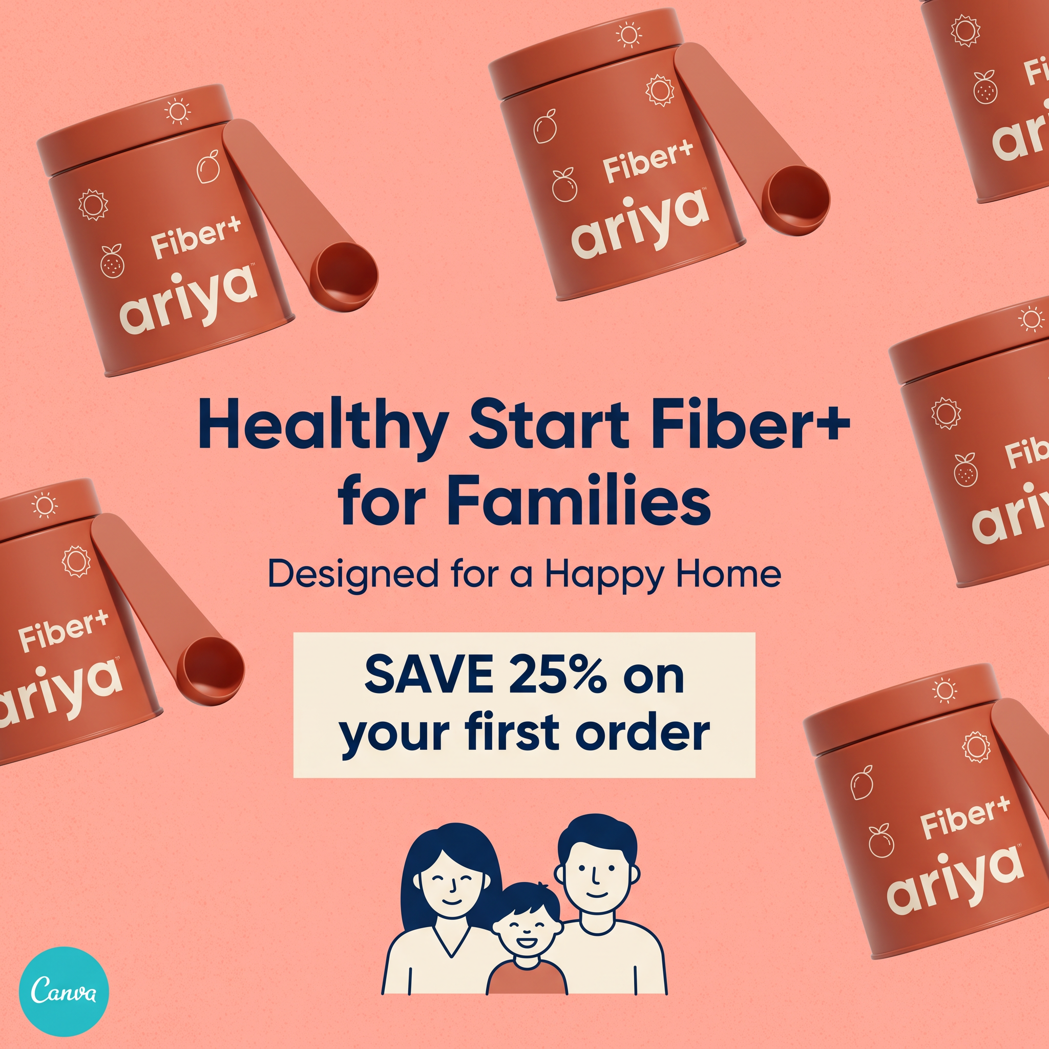
Seeing the tin seven times fixes the packaging in memory. Shoppers will recognise it on the shelf or site.
- 02
Clear first-order offer
A 25% discount lowers the risk of trying something new. The cream box isolates it as the main message.
- 03
Family positioning broadens appeal
The family illustration shows it is for everyone at home. It frames fiber as a shared healthy habit.
- 04
Monochrome with contrast
Coral and terracotta create a cohesive, warm look. Navy text stands out sharply for readability.
Full creative breakdown
Who this ad targets
This ad targets parents aged 28–45, especially mums, who manage family nutrition and want an easy way to add more fiber to everyday meals. They look for products that are healthy, kid-friendly and convenient, and are open to trying new DTC wellness brands when there is a good introductory offer. They respond to warm, friendly branding over clinical supplement design and like products that look nice on the kitchen counter.
Copywriting analysis
The headline names the product, its category and audience in one line: 'Healthy Start Fiber+ for Families'. 'Healthy start' suggests both morning routines and early childhood habits. 'Designed for a Happy Home' adds an emotional, aspirational tone. The offer is the strongest copy: 'Save 25% on your first order' is concrete, time-agnostic and easy to understand. Capitalising SAVE 25% puts the benefit first. There is no long ingredient list, keeping the message simple for a busy parent scrolling quickly.
Visual design
A textured coral background sets a warm, inviting mood. Terracotta tins float at different angles, some cropped by the frame, creating a dynamic border that leads the eye to the centre. The navy rounded sans serif headline offers strong contrast. A cream offer box separates the discount from the rest. A simple navy and cream family illustration at the bottom adds friendliness and balance.
How to adapt this template for your brand
- Shoot or render your product from one angle and repeat it around the frame.
- Put a short product-plus-audience headline in the centre.
- Place your offer in a contrasting box below the headline.
- Add a simple illustration of who the product is for.
- Keep the background and product in one colour family.
Tips for health & fitness ads on Meta
On Meta, use this for conversion campaigns targeting new customers and exclude past buyers. Match the offer and code exactly on the landing page. For Reels and Stories, animate the tins floating or spinning around the offer. Test a version with an expiry date to add urgency. Remove template watermarks or logos before running the ad live.
About this creative
This square image ad for Ariya Fiber+ uses a playful pattern of floating product tins. Seven terracotta tins, each with a matching scoop and simple sun and fruit icons, are scattered at angles around the edges of a soft coral background. Some are cropped at the frame edge, which adds movement. In the centre, a navy headline reads 'Healthy Start Fiber+ for Families', followed by the softer line 'Designed for a Happy Home'. Below sits a cream box with the offer: 'Save 25% on your first order'. At the bottom, a line illustration of a smiling mum, dad and child reinforces the family positioning. A Canva logo badge appears in the bottom left corner, suggesting the creative was made from a Canva template. The warm monochrome palette makes the navy text pop. The ad combines product repetition, family appeal and a clear first-order incentive to drive conversions.
Meta ad · 1200 × 1200 · Health & Fitness
Fiber Supplement Ad Template: Floating Tins + First-Order Offer
This Ariya Fiber+ ad surrounds a centred headline and a bold 25% first-order discount with floating terracotta product tins on a coral background. A simple family illustration anchors the bottom. It is a square offer image for Meta, ideal for supplement and DTC brands driving first purchases.
Added
All brand names and logos are property of their owners. Adplaylist is not affiliated with or endorsed by these brands.
Details
Ad copy
Primary text
Healthy habits start at home. 🏡 Ariya Fiber+ is the easy daily fiber boost the whole family can enjoy. Save 25% on your first order today.
Description
Healthy Start Fiber+ for the whole family.
On-image text
Fiber+ ariya (on each tin). Healthy Start Fiber+ for Families. Designed for a Happy Home. SAVE 25% on your first order. Canva (logo badge)
Headline ideas for this template
- 1Save 25% on your first order of Fiber+
- 2Healthy starts for the whole family
- 3Fiber the whole family will love
- 4Your family's daily fiber boost
- 5Designed for a happy, healthy home
Meta image ad specs
| Placement | Ratio | Size (px) |
|---|---|---|
| Feed | 1:1 or 4:5 | 1080×1080 / 1080×1350 |
| Marketplace | 1:1 | 1200×1200 |
| Messenger inbox | 1:1 | 1200×1200 |
| Stories & Reels | 9:16 | 1080×1920 |
This template is 1:1. Request 4:5 or 9:16 to cover all placements.
Browse similar by tag