Key takeaways
- Format: Results stats slide in a case study carousel
- Best for: Proof-led retargeting for enterprise buyers
- Hook: Two oversized numbers summarise the customer outcome
- Reuse it: Pull the two strongest numbers from a case study and make them huge
Available sizes
What is a testimonial ad?
A testimonial ad uses a real customer's words, such as a review, quote or comment, as the main message. It answers a buyer's doubts with social proof rather than brand claims, and works especially well when the testimonial is specific about who the customer is and what changed for them.
See all testimonial ads →Why this testimonial ad works
- 01
Numbers stop the eye
Very large figures are the first thing seen and are remembered after the scroll.
- 02
Only two stats
Limiting it to two numbers avoids overload and keeps the message clear.
- 03
Icon changes per slide
The trend arrow replaces the swipe arrow, signalling growth and progression in the story.
- 04
Consistent template
Same label, footer and colours make the carousel feel cohesive and professional.
Full creative breakdown
Who this ad targets
This ad targets HR, payroll and finance leaders at enterprises and multinationals, especially those running payroll in several countries through a patchwork of local providers. They are late in the buying journey, comparing vendors and looking for evidence that a platform works at scale. Showing a recognisable consulting firm as a customer gives risk-averse buyers social proof and helps internal champions build a business case for consolidating payroll with Deel.
Copywriting analysis
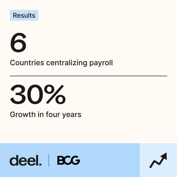
This slide has almost no copy, which is the point. Results as the label tells the viewer exactly what they are looking at. The first stat, 6 Countries centralizing payroll, shows scope and complexity, proving Deel works across multiple jurisdictions. The second, 30% Growth in four years, links Deel to business growth, implying the platform supported the company's expansion. Captions are short, factual and lowercase-led, letting the numbers dominate. There is no claim language or adjectives, which makes the slide feel objective and trustworthy, exactly what sceptical enterprise buyers want.
Visual design
Oversized black numerals on a warm cream background create strong hierarchy and an editorial, annual-report feel. A thin rule divides the two stats into clear sections. The light blue label and footer carry over from the first slide, and the trend arrow icon visually reinforces growth. The design uses lots of empty space, keeping it calm, premium and easy to scan on mobile.
How to adapt this template for your brand
- Get approval from a well-known customer to use their name and logo.
- Lead with a short case study headline that names the customer and the outcome.
- Follow with a slide of two or three hard numbers and a slide with a named quote.
- Use a co-branded footer with both logos and a consistent icon per slide.
- Run it as a carousel to retargeting audiences and decision-makers in the consideration stage.
Tips for hr software ads on Meta
These slides are designed to run as a carousel. On LinkedIn, use a carousel or document ad so buyers swipe from claim to numbers to quote; on Meta, use the carousel format with one headline per card and the same landing page. Lead with the strongest card, keep the arrow icon as a swipe cue and target HR, payroll and finance job titles. Retargeting website visitors with proof-led carousels usually lifts conversion.
About this creative
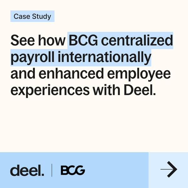
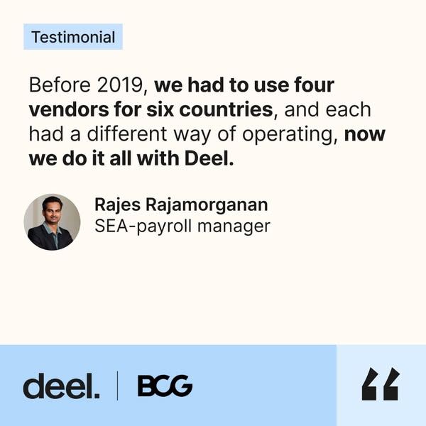
The second card of the Deel x BCG carousel keeps the same layout as the opener. On a cream background, a light blue label at top left reads Results. Below it, a huge black 6 sits above the caption Countries centralizing payroll. A thin black horizontal rule separates it from the second stat: a huge 30% with the caption Growth in four years. The bottom band is light blue with the Deel logo, a divider and the BCG logo, and the pale blue tile at bottom right holds a black upward trend arrow instead of the previous slide's swipe arrow. There is no photography, illustration or extra copy. The slide is designed to be read in two seconds, with the numbers doing all the work. Paired with the case study opener and the testimonial slide, it forms a complete proof sequence: claim, data and human voice, a structure that works well for B2B decision-makers looking for evidence.
Meta ad · 338 × 600 · HR Software
Deel x BCG Results Ad: 6 Countries, 30% Growth
This Deel ad is the results slide of a BCG case study carousel, showing two big numbers: 6 countries centralizing payroll and 30% growth in four years. The clean, co-branded square uses oversized figures and a trend arrow to turn a customer story into quick, scannable proof for enterprise buyers.
Added
All brand names and logos are property of their owners. Adplaylist is not affiliated with or endorsed by these brands.
Details
Ad copy
Primary text
6 countries centralizing payroll. 30% growth in four years. See how BCG scaled payroll with Deel.
Description
6 countries, 30% growth
On-image text
Results | 6 | Countries centralizing payroll | 30% | Growth in four years | deel. | BCG
Headline ideas for this template
- 16 countries. 1 payroll. 30% growth.
- 2The numbers behind BCG's payroll switch
- 3Scale payroll across borders like BCG
- 4Proof that global payroll can be simple
- 5What centralized payroll did for BCG
Meta image ad specs
| Placement | Ratio | Size (px) |
|---|---|---|
| Feed | 1:1 or 4:5 | 1080×1080 / 1080×1350 |
| Marketplace | 1:1 | 1200×1200 |
| Messenger inbox | 1:1 | 1200×1200 |
| Stories & Reels | 9:16 | 1080×1920 |
This template is 1:1. Request 4:5 or 9:16 to cover all placements.
Browse similar by tag