Key takeaways
- Format: Minimal single-product shot with dramatic shadow
- Best for: Contact lens brands, beauty and wellness DTC brands
- Hook: A strikingly simple image that stops the scroll through calm
- Reuse it: Use one hand, one product and one bold colour; let the shadow add drama
Available sizes
What is a product shot ad?
A product shot ad puts the product itself at the centre of the frame, usually on a clean or styled background with little text. It works best when the packaging or product is distinctive enough to stop the scroll and the viewer already understands what it does.
See all product shot ads →Why this product shot ad works
- 01
Radical simplicity
With only one hand, one lens and one colour, nothing competes for attention and the product stands out.
- 02
Warm, unexpected colour
Terracotta breaks from the typical clinical blue of eye care, making the ad feel lifestyle and fashion-led.
- 03
Shadow adds drama
The long shadow creates depth and an artistic look that signals a premium brand.
- 04
Inclusive and human
The deep brown hand adds warmth and representation while keeping the focus on the product.
Full creative breakdown
Who this ad targets
This ad targets style-conscious adults roughly 22 to 45 who see contact lenses as part of their lifestyle and appearance rather than a medical necessity. The amber-tinted lens hints at coloured or enhancing lenses, which appeals to beauty and fashion audiences. They respond to minimal, design-led brands in skincare and fashion, and are likely to buy online. It also suits people of colour who rarely see themselves in eye care ads, broadening the brand's appeal.
Copywriting analysis
'See life differently.' works on two levels: literally, clearer or enhanced vision, and figuratively, a fresh perspective on life. The full stop adds confidence. The subline 'Premium contact lenses, designed for your life' clearly states the product and positions it as premium and personal, using 'designed' to suggest care and craft. The copy contains no technical claims, which fits the lifestyle positioning but leaves out reasons to believe such as moisture or wear time. 'Explore lenses' is a soft, browse-oriented CTA. Adding a brand name and a single proof point would improve recall and conversion.
Visual design
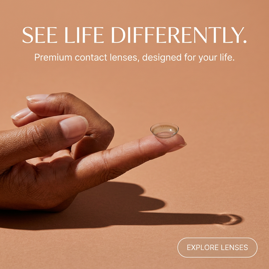
The design is built on one flat terracotta colour, a single horizontal hand and a long diagonal shadow. The hand sits in the centre left, while the shadow leads the eye toward the CTA in the bottom right, creating a natural reading path. A thin, elegant serif headline gives a fashion editorial tone, paired with a light sans-serif subline. Everything in white keeps contrast high on the warm background, and ample negative space signals luxury.
How to adapt this template for your brand
- Pick one bold, warm or unexpected background colour for your category.
- Photograph a single hand holding your product with hard directional light.
- Let the shadow lead the eye toward the CTA.
- Write a double-meaning headline about seeing, feeling or living differently.
- Add your logo and an outlined CTA button in a corner.
Tips for contact lenses ads on Meta
On Meta, this minimal creative performs well in Instagram Feed and Explore, where design-led content fits naturally. Add your brand name in the primary text and the ad header since the image has none. Test a 4:5 version with more space above the headline. For Reels, animate the shadow moving slowly to suggest time passing during the day. On Pinterest, the warm colour and minimal style can be strong for beauty and lifestyle audiences.
About this creative
This square ad uses a solid warm terracotta or peach background that fills the entire frame. In the centre left, a hand with deep brown skin and short natural nails extends horizontally, with the index finger pointing right and balancing a single clear contact lens with a subtle amber tint on its tip. Strong directional light from the upper left casts a long, crisp shadow of the hand and lens across the surface toward the bottom right, adding depth and an artistic, editorial quality. At the top, the headline 'See life differently.' is set in large, thin white serif capitals, with the line 'Premium contact lenses, designed for your life.' in a smaller white sans-serif beneath. In the bottom right corner, a white outlined pill button reads 'Explore lenses'. There is no logo or brand name, so the creative feels like a clean, unbranded template focused entirely on mood and the product.
Meta ad · 1200 × 1200 · Contact Lenses
Contact Lens Ad Template: Minimal Hand Product Shot
This premium contact lens ad shows a single hand balancing a lens on a fingertip against a warm terracotta background with a long, dramatic shadow. It is a minimal square image template for lens brands, optical retailers and any beauty or wellness product sold on simplicity and quality.
Added
All brand names and logos are property of their owners. Adplaylist is not affiliated with or endorsed by these brands.
Details
Ad copy
Primary text
Premium contact lenses designed around your life, not the other way around. Lightweight, comfortable and made to fit seamlessly into your day. Explore our range and see life differently.
Description
Premium contact lenses, designed for your life.
On-image text
SEE LIFE DIFFERENTLY. | Premium contact lenses, designed for your life. | EXPLORE LENSES
Headline ideas for this template
- 1A new way to see your day
- 2Lenses that fit your life
- 3Small lens, big difference
- 4Comfort you can't see, clarity you can
- 5Look closer. See more.
Meta image ad specs
| Placement | Ratio | Size (px) |
|---|---|---|
| Feed | 1:1 or 4:5 | 1080×1080 / 1080×1350 |
| Marketplace | 1:1 | 1200×1200 |
| Messenger inbox | 1:1 | 1200×1200 |
| Stories & Reels | 9:16 | 1080×1920 |
This template is 1:1. Request 4:5 or 9:16 to cover all placements.
Browse similar by tag