Key takeaways
- Format: Lo-fi newspaper print with an implied comparison headline
- Best for: Challenger brands taking on an established habit or category
- Hook: 'Fight inflammation. Not cause it.' frames coffee as the problem
- Reuse it: Write a two-part should/not headline and set it in heavy type on a gritty print texture
Available sizes
What is a comparison ad?
A comparison ad sets the product against an alternative, such as a competitor, the old way of doing things or a cheaper option, usually in a two-column layout or table. It helps buyers who are already weighing options see quickly why this one is the better choice.
See all comparison ads →Why this comparison ad works
- 01
Implied comparison
It positions against coffee without naming it, which feels bold yet safe.
- 02
Pattern interrupt
The raw black-and-white print stands out in a colourful feed.
- 03
Ingredient rhythm
One-word sentences turn the ingredient list into a chant-like manifesto.
- 04
Clear destination
Ending on mudwtr.com works even when people don't click.
Full creative breakdown
Who this ad targets
This ad targets health-conscious adults aged 25–50 who are aware of inflammation, gut health and anti-inflammatory foods like turmeric and ginger. Many have heard that coffee can be harsh on the stomach or worsen anxiety and are open to alternatives. The rebellious print style also appeals to people who distrust polished advertising and prefer brands with a point of view.
Copywriting analysis
The headline uses a 'should… not…' structure that sets up a clear contrast: your morning drink should fight inflammation, not cause it. It relies on the reader to fill in the blank (coffee), which makes it more engaging and avoids an explicit claim. Breaking the headline into many short lines gives it weight and makes it readable from a distance. The ingredient list, written as one-word sentences, works as proof and rhythm. Ending with the URL rather than a CTA reinforces the print-ad feel. Note that health-related claims like inflammation need careful compliance review.
Visual design
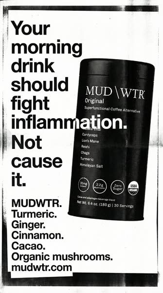
Pure black and white with heavy grain, fold marks and photocopy artefacts gives a punk, zine-like aesthetic. A massive bold sans-serif headline fills the left two-thirds, while the tin is placed at an angle on the right, overlapping the type for depth. Hard contrast and overexposure make the tin's badges pop. Ragged edges and a black border frame the page. There's no colour at all, which is the main pattern interrupt.
How to adapt this template for your brand
- Write a two-part headline: what your category should do vs what the incumbent does
- Set it in very heavy sans-serif type, stacked on short lines
- Place your pack at an angle overlapping the headline
- Apply a grainy photocopy or newspaper texture in black and white
- List your key ingredients as one-word sentences and end with your URL
Tips for beverages ads on Meta
Built for Meta Stories and Reels; the strong contrast reads well on small screens. Be careful with health claims such as fighting inflammation: Meta and the FTC require substantiation, so consider softer wording like 'with anti-inflammatory ingredients'. The style also works as a 4:5 feed ad and as an out-of-home poster. Test against a colourful product shot to see if the pattern interrupt improves thumb-stop rate.
About this creative
This 9:16 creative looks like a page torn from a newspaper or a photocopied flyer. It's entirely black and white, with grainy texture, uneven edges and visible print noise. The left side is dominated by a stacked, heavy sans-serif headline: 'Your morning drink should fight inflammation. Not cause it.' The word 'inflammation' runs across the MUD WTR Original tin, which is placed on the right at an angle, high-contrast and slightly overexposed so its badges for caffeine, mushrooms, zero sugar and USDA Organic stand out. Below the headline, a punchy list reads 'MUDWTR. Turmeric. Ginger. Cinnamon. Cacao. Organic mushrooms.' and ends with 'mudwtr.com'. The ad never names coffee, but the 'not cause it' line implies the comparison. The lo-fi print look feels like an activist manifesto, which suits a challenger brand and stands out against polished, colourful feed content.
Meta ad · 338 × 600 · Beverages
MUD WTR Newspaper Ad: Fight Inflammation, Not Cause It
This vertical MUD WTR story ad mimics a gritty black-and-white newspaper print, with a huge headline comparing its drink to coffee on inflammation and a punchy list of ingredients. It's a bold template for challenger brands making a direct comparison with a category leader.
Added
All brand names and logos are property of their owners. Adplaylist is not affiliated with or endorsed by these brands.
Details
Ad copy
Primary text
Your morning drink should help, not hurt. MUD WTR blends turmeric, ginger, cinnamon, cacao and organic mushrooms into a coffee alternative made for calmer mornings.
Description
Turmeric, ginger, cacao & organic mushrooms
On-image text
Your morning drink should fight inflammation. Not cause it.; MUDWTR. Turmeric. Ginger. Cinnamon. Cacao. Organic mushrooms. mudwtr.com; MUD\WTR Original, Superfunctional Coffee Alternative; 35mg Caffeine; 2.2g Mushrooms; Zero Sugar; USDA Organic
Headline ideas for this template
- 1Your morning drink should help, not hurt
- 2Turmeric > another espresso
- 3Start your day with ingredients that work for you
- 4Not coffee. Better.
- 5Read the ingredients. Then decide.
Meta image ad specs
| Placement | Ratio | Size (px) |
|---|---|---|
| Feed | 1:1 or 4:5 | 1080×1080 / 1080×1350 |
| Marketplace | 1:1 | 1200×1200 |
| Messenger inbox | 1:1 | 1200×1200 |
| Stories & Reels | 9:16 | 1080×1920 |
This template is 1:1. Request 4:5 or 9:16 to cover all placements.