Key takeaways
- Format: Repeating product grid with a clean central copy band
- Best for: Building packaging recognition for a retail launch
- Hook: A full wall of bottles signals abundance and availability
- Reuse it: Repeat any distinctive pack in a grid and place copy in a faded centre strip
Available sizes
What is a product shot ad?
A product shot ad puts the product itself at the centre of the frame, usually on a clean or styled background with little text. It works best when the packaging or product is distinctive enough to stop the scroll and the viewer already understands what it does.
See all product shot ads →Why this product shot ad works
- 01
Packaging becomes memorable
Seeing the bottle dozens of times trains recall for the moment the shopper stands in the aisle.
- 02
Pattern stops the scroll
Rhythmic repetition looks different from typical lifestyle ads and creates a strong pattern interrupt.
- 03
Inclusive headline
“for All” broadens the brand from niche wellness to everyday families shopping at a mass retailer.
- 04
Badge adds urgency without clutter
The circular Target sticker communicates news while leaving the centre message untouched.
Full creative breakdown
Who this ad targets
This ad targets mainstream Target shoppers rather than only committed clean-living fans. The ‘for All’ message invites budget-conscious families, students and first-time buyers to try non-toxic cleaning. It also reinforces recognition among people who have seen Branch Basics on social media and now need to spot it in store. The likely audience is US adults aged 22–45 interested in home, family and wellness.
Copywriting analysis
The copy is minimal and inclusive. “Human-Safe Cleaning for All” turns the brand's core phrase into a democratic promise, implying non-toxic cleaning is no longer a luxury. Only two claims are listed, the most important for the mass market: fragrance-free and plant & mineral-based. The Target badge carries the news, so the headline can stay evergreen. No price is mentioned, keeping it brand-led rather than promotional.
Visual design
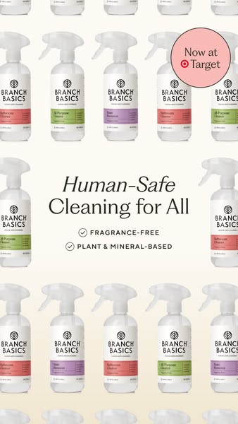
The bottles are arranged in offset rows, cropped at the frame edges so the pattern feels endless. A white-to-cream gradient fades the middle rows to create breathing space for type. Label colours are soft pastels, keeping the overall look gentle. The coral badge echoes the bathroom cleaner band and adds a single focal accent in the corner. Typography pairs italic and roman serif for a refined editorial feel.
How to adapt this template for your brand
- Shoot one product front-on against a plain background.
- Duplicate it into offset rows, alternating colour variants.
- Fade the centre into a solid band for the headline.
- Add one or two short check-mark claims under the headline.
- Place a round news badge in a corner for retailer or launch info.
Tips for cleaning products ads on Meta
Built for Meta Stories and Reels placements, so keep the top 14% and bottom 20% free of key text where profile icons and the CTA sticker sit. Run it as a static Story first, then test a 3–5 second motion version (slow zoom or text reveal). Pair it with a matching 4:5 crop for Feed so Advantage+ placements can pick the best fit, and keep the offer or claim in the first line of primary text for viewers who skip the image.
About this creative
This vertical ad from Branch Basics uses a repeating product pattern as its main visual. Rows of identical white-labelled spray bottles, shot front-on, fill the top and bottom thirds of the frame. Their colour bands alternate between coral for the Bathroom Cleaner, green for All-Purpose Cleaner and lilac for Stain Remover, creating a rhythmic, almost wallpaper effect. In the middle third, the bottles fade into a soft cream band that holds the copy: “Human-Safe Cleaning for All”, with ‘Human-Safe’ in italic serif, followed by two check-mark lines reading Fragrance-Free and Plant & Mineral-Based. A coral circle badge in the top right corner says “Now at Target” with the bullseye logo. The overall effect is tidy, bright and highly brand-recognisable, which helps shoppers remember the bottle when they later see it in the cleaning aisle. It works well as an awareness creative at the start of a retail launch.
Meta ad · 338 × 600 · Cleaning Products
“Human-Safe Cleaning for All” Product Pattern Ad
This Branch Basics story ad repeats rows of colour-coded spray bottles as a wallpaper pattern, with a clean centre band carrying the headline “Human-Safe Cleaning for All” and two claims. A round “Now at Target” badge sits top right. Use product patterns to build shelf recognition and show a full range.
Added
All brand names and logos are property of their owners. Adplaylist is not affiliated with or endorsed by these brands.
Details
Ad copy
Primary text
Human-safe cleaning for every home. 🌿 Branch Basics All-Purpose Cleaner, Bathroom Cleaner and Stain Remover are fragrance-free, plant & mineral-based – and now at Target. Your cleaner cupboard upgrade is one aisle away.
Description
Fragrance-free, now at Target
On-image text
Now at Target | Human-Safe Cleaning for All | FRAGRANCE-FREE | PLANT & MINERAL-BASED
Headline ideas for this template
- 1Spot Us in the Cleaning Aisle
- 2Safer Cleaning, Now for Every Home
- 3The Bottle You'll See Everywhere
- 4Clean Living Shouldn't Be Exclusive
- 5Fragrance-Free Cleaning, Wall to Wall
Meta image ad specs
| Placement | Ratio | Size (px) |
|---|---|---|
| Feed | 1:1 or 4:5 | 1080×1080 / 1080×1350 |
| Marketplace | 1:1 | 1200×1200 |
| Messenger inbox | 1:1 | 1200×1200 |
| Stories & Reels | 9:16 | 1080×1920 |
This template is 1:1. Request 4:5 or 9:16 to cover all placements.