Key takeaways
- Format: Side-by-side product comparison with equals sign
- Best for: Tech accessories and products that replace several items with one
- Hook: One charger equals two: the value is clear before reading a word
- Reuse it: Put your product next to the clunky alternative and list three wins each
Available sizes
What is a comparison ad?
A comparison ad sets the product against an alternative, such as a competitor, the old way of doing things or a cheaper option, usually in a two-column layout or table. It helps buyers who are already weighing options see quickly why this one is the better choice.
See all comparison ads →Why this comparison ad works
- 01
Instant visual math
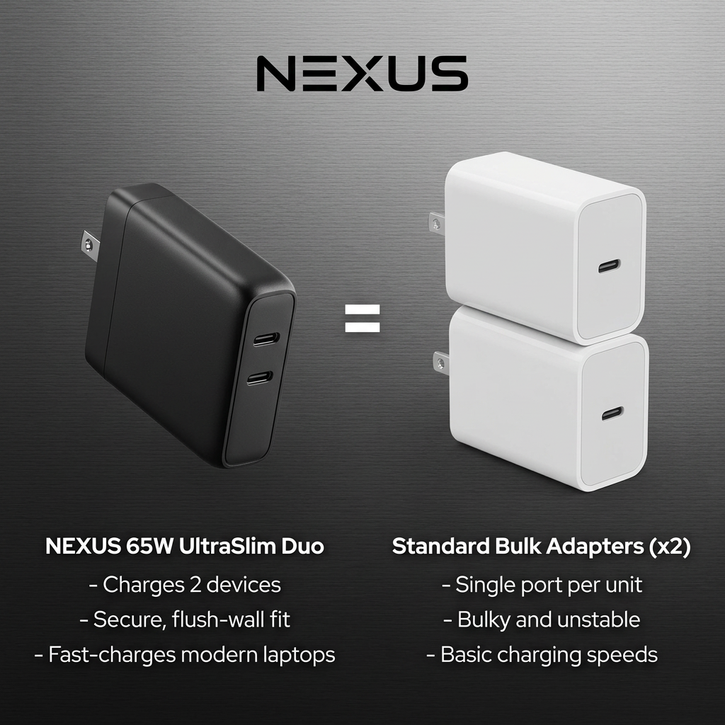
The equals sign tells the story in one glance: one Nexus replaces two ordinary chargers. No reading needed to get the value.
- 02
Mirrored bullet lists
Each Nexus benefit lines up with a competitor weakness, making the comparison fair-looking and easy to scan.
- 03
Colour contrast
Sleek matte black versus generic white makes Nexus look premium and the alternative look basic, without saying it.
- 04
Practical benefits
Two ports, flush fit and laptop fast-charging solve everyday annoyances that buyers already recognise.
Full creative breakdown
Who this ad targets
This ad targets laptop and smartphone users aged roughly 22–50, including remote workers, students, business travellers and digital nomads who carry several chargers and want to simplify. They own USB-C laptops such as MacBooks or recent Windows ultrabooks and are frustrated by bulky bricks that fall out of wall sockets. They value compact, reliable gear and are willing to pay more for quality. Gift buyers looking for useful tech stocking fillers are a secondary audience.
Copywriting analysis
The copy is functional and structured. The product name, “65W UltraSlim Duo”, carries three selling points by itself: power, size and dual ports. Bullet lists mirror each other point for point, which makes the comparison feel objective. Negative words like “bulky and unstable” and “basic” sharpen the contrast without naming competitors. The copy could be stronger with specifics: which devices it fast-charges, the real size difference or charging time. Adding a price or saving would turn the comparison into a value argument.
Visual design
The dark brushed-metal background gives a premium tech look and makes the white elements stand out. The layout is perfectly symmetrical: product left, equals sign centre, competitors right, text below each. The black Nexus charger is shown at a slight angle to reveal both ports, while the stacked white adapters emphasise bulk. Bold centred labels and short bullets keep text readable on mobile. The minimal design keeps the focus fully on the comparison.
How to adapt this template for your brand
- Pick the clunky alternative your product replaces
- Place your product and the alternative side by side with an equals or vs sign
- Write three matching benefit-versus-weakness bullet pairs
- Use colour contrast to make your product look premium
- Add a concrete spec, price or saving to strengthen the argument
Tips for chargers ads on Meta
On Meta, use this in Feed and Stories with primary text that tells a relatable travel or desk-clutter story. Test a version with real device logos removed to stay within policy. On Google, use it in Shopping and Performance Max, where comparison images stand out among plain product shots. Target search terms like “dual USB-C charger” and retarget people who viewed laptop accessories.
About this creative
A square comparison ad for Nexus, a tech accessories brand. The background is a dark brushed-metal gradient, giving an industrial, premium feel. The NEXUS wordmark sits centred at the top in bold black type. On the left is a slim, matte black wall charger with US prongs and two USB-C ports. In the centre, a large white equals sign links it to the right side, where two bulky white single-port USB-C adapters are stacked on top of each other. Below each side is a white bold label with three bullet points. The left side, NEXUS 65W UltraSlim Duo, lists charging two devices, a secure flush-wall fit and fast-charging modern laptops. The right side, Standard Bulk Adapters (x2), lists a single port per unit, being bulky and unstable, and basic charging speeds. The black-versus-white contrast makes the Nexus product feel sleek and premium.
Meta ad · 1200 × 1200 · Chargers
Charger Ad Template: Nexus UltraSlim Duo Comparison
This Nexus ad compares its 65W UltraSlim Duo dual-port charger with two standard single-port adapters. An equals sign and side-by-side bullet lists make the value clear in seconds. Use it as a template for tech accessories or any product that replaces several items with one better one.
Added
All brand names and logos are property of their owners. Adplaylist is not affiliated with or endorsed by these brands.
Details
Ad copy
Primary text
Why carry two bulky chargers when one slim one does it all? The NEXUS 65W UltraSlim Duo charges your laptop and phone at the same time, sits flush against the wall and fits in any bag.
Description
65W fast charging for laptops and phones
On-image text
NEXUS. NEXUS 65W UltraSlim Duo: Charges 2 devices. Secure, flush-wall fit. Fast-charges modern laptops. = Standard Bulk Adapters (x2): Single port per unit. Bulky and unstable. Basic charging speeds.
Headline ideas for this template
- 1Two Chargers? Not Anymore.
- 2Charge Your Laptop and Phone at Once
- 3The Last Charger You'll Need to Pack
- 4Slim Enough for Any Bag
- 5Ditch the Bulky Bricks
Meta image ad specs
| Placement | Ratio | Size (px) |
|---|---|---|
| Feed | 1:1 or 4:5 | 1080×1080 / 1080×1350 |
| Marketplace | 1:1 | 1200×1200 |
| Messenger inbox | 1:1 | 1200×1200 |
| Stories & Reels | 9:16 | 1080×1920 |
This template is 1:1. Request 4:5 or 9:16 to cover all placements.
Browse similar by tag