Key takeaways
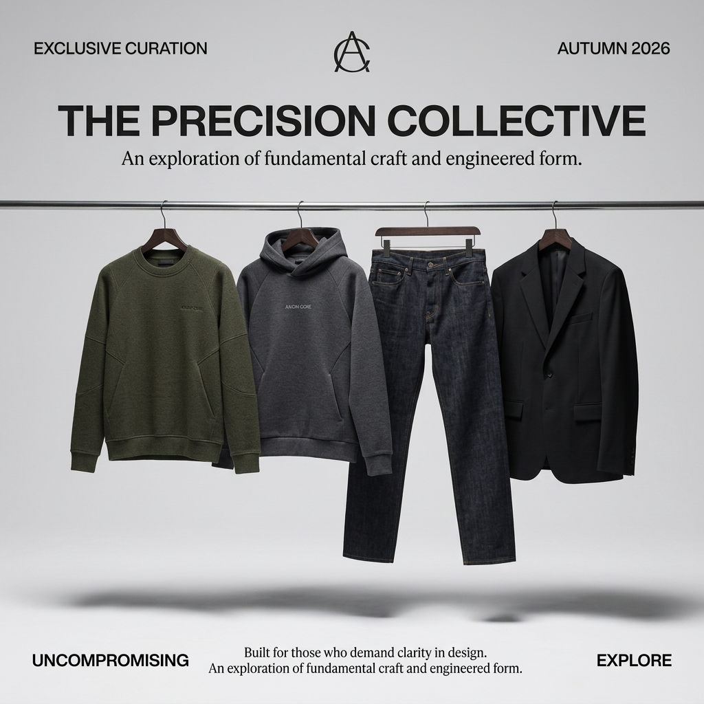
- Format: Clean product line-up on a rail with editorial corner typography.
- Best for: Capsule wardrobes, seasonal drops and curated product bundles.
- Hook: Four essential pieces shown as a complete, considered wardrobe.
- Reuse it: Hang three to five hero pieces on a rail and frame them with four corner labels.
Available sizes
What is a product shot ad?
A product shot ad puts the product itself at the centre of the frame, usually on a clean or styled background with little text. It works best when the packaging or product is distinctive enough to stop the scroll and the viewer already understands what it does.
See all product shot ads →Why this product shot ad works
- 01
The whole collection at a glance
Four garments side by side show range and how pieces work together, without needing a model.
- 02
Editorial framing
Corner labels and a central monogram feel like a magazine spread, which raises perceived value.
- 03
Floating effect
Soft floor shadows make the clothes look suspended, adding a subtle, gallery-like touch.
- 04
Seasonal urgency
'Autumn 2026' and 'Exclusive curation' suggest a limited, timely drop.
Full creative breakdown
Who this ad targets
The ad targets men aged about 25 to 45 who prefer a minimal, capsule approach to dressing and want versatile, high-quality basics. They value design clarity and craftsmanship, and are likely to research products before buying. The mix of knitwear, hoodie, denim and blazer suits people who move between casual and smart settings and want a coordinated wardrobe. It also appeals to buyers updating their autumn wardrobe in one go.
Copywriting analysis
The copy borrows the language of design and engineering: 'precision', 'engineered form', 'clarity in design' and 'uncompromising'. This positions basic garments as thoughtfully made pieces. The headline names the collection and acts as the brand idea. Corner labels like 'Exclusive curation' and 'Autumn 2026' add exclusivity and timeliness. However, the line 'An exploration of fundamental craft and engineered form' appears twice, once under the headline and again at the bottom, which feels like an editing slip and should be replaced with a new line. 'Explore' is a soft CTA that suits browsing. No prices or fabric details are given, so the landing page must carry those.
Visual design
The layout is symmetrical: a centred headline, a monogram at the top and a horizontal steel rail splitting the frame. Four garments are evenly spaced, with alternating colours of olive, grey, indigo and black. Typography mixes a bold geometric sans-serif for labels and the headline with a classic serif for supporting lines. The light grey background and soft shadows keep the focus on the products.
How to adapt this template for your brand
- Pick three to five hero pieces that form a complete look or capsule.
- Photograph them on matching hangers on a simple rail against a plain light background.
- Add your collection name as a bold headline with a short serif subline.
- Frame the image with four short corner labels, such as season, edition, value and CTA.
- Proofread for repeated lines and test a version with prices under each piece.
Tips for fashion ads on Meta
On Meta, use this as the cover image of a carousel where each following card shows one garment in detail. The symmetrical layout also works as a collection ad header linked to a product catalogue. On Google, it suits Performance Max and Display, as the grey background crops cleanly. For Stories, stack the garments vertically or zoom into two pieces. Launch at the start of the season and retarget viewers with individual product ads.
About this creative
This square ad presents an autumn 2026 capsule collection as a clean product line-up. A thin steel rail spans the full width of a light grey studio, and four garments hang from it on wooden hangers: an olive-green crewneck sweater with seam details, a charcoal pullover hoodie, a pair of dark indigo raw denim jeans and a black single-breasted blazer. Soft shadows on the floor below make them appear to float. The top section uses a magazine-style frame: 'EXCLUSIVE CURATION' top left, an interlocking monogram logo in the centre and 'AUTUMN 2026' top right. Below, a bold black sans-serif headline reads 'THE PRECISION COLLECTIVE', with a serif subline about fundamental craft and engineered form. The bottom row repeats the frame with 'UNCOMPROMISING' on the left, a short centred serif statement and 'EXPLORE' on the right as a subtle CTA. The muted palette feels calm, considered and premium.
Meta ad · 1200 × 1200 · Fashion
Capsule Collection Ad Template: Four Pieces on a Rail
This square fashion ad shows four garments, a sweater, hoodie, jeans and blazer, hanging on a steel rail in a minimal grey studio. Editorial headline and corner labels frame the collection. Use it as a template for capsule wardrobes, seasonal drops and curated product sets.
Added
All brand names and logos are property of their owners. Adplaylist is not affiliated with or endorsed by these brands.
Details
Ad copy
Primary text
Four pieces. One considered wardrobe. The Precision Collective brings together a knit sweater, a heavyweight hoodie, raw denim and a tailored blazer for autumn 2026. Explore the curation.
Description
An exploration of fundamental craft and engineered form.
On-image text
EXCLUSIVE CURATION | AUTUMN 2026 | THE PRECISION COLLECTIVE | An exploration of fundamental craft and engineered form. | UNCOMPROMISING | Built for those who demand clarity in design. An exploration of fundamental craft and engineered form. | EXPLORE
Headline ideas for this template
- 1Four pieces. Endless outfits.
- 2Your autumn capsule, curated
- 3Essentials, engineered
- 4Build a wardrobe that works harder
- 5Clarity in every stitch
Meta image ad specs
| Placement | Ratio | Size (px) |
|---|---|---|
| Feed | 1:1 or 4:5 | 1080×1080 / 1080×1350 |
| Marketplace | 1:1 | 1200×1200 |
| Messenger inbox | 1:1 | 1200×1200 |
| Stories & Reels | 9:16 | 1080×1920 |
This template is 1:1. Request 4:5 or 9:16 to cover all placements.