Key takeaways
- Format: Product shot grid showing every colorway in one frame.
- Best for: Launching a product that comes in several colors or sizes.
- Hook: Five matching caps in different colors invite the viewer to pick a favorite.
- Reuse it: Line up your variants on a neutral background and name the fits or sizes.
Available sizes
What is a product shot ad?
A product shot ad puts the product itself at the centre of the frame, usually on a clean or styled background with little text. It works best when the packaging or product is distinctive enough to stop the scroll and the viewer already understands what it does.
See all product shot ads →Why this product shot ad works
- 01
Choice is the hook
Seeing five colors at once makes people mentally choose one. That small decision pulls them closer to buying.
- 02
Fit sizes solve an objection
Many people avoid caps because they never fit. Naming XS, Regular and XL removes that worry before it comes up.
- 03
Calm catalogue aesthetic
Textured paper, soft shadows and lots of space feel premium and stand out in a busy feed full of loud ads.
- 04
Typography mix adds character
A serif brand name, bold sans headline and monospaced label create clear hierarchy and a crafted, workwear-inspired tone.
Full creative breakdown
Who this ad targets
The ad targets men and women aged roughly 25 to 45 who like rugged, heritage-inspired basics and outdoor or workwear style. They value durable materials and natural, washed colors over loud logos. People with larger or smaller heads who struggle to find a cap that fits are a clear secondary audience. The tagline about the journey also appeals to travellers and weekend hikers.
Copywriting analysis
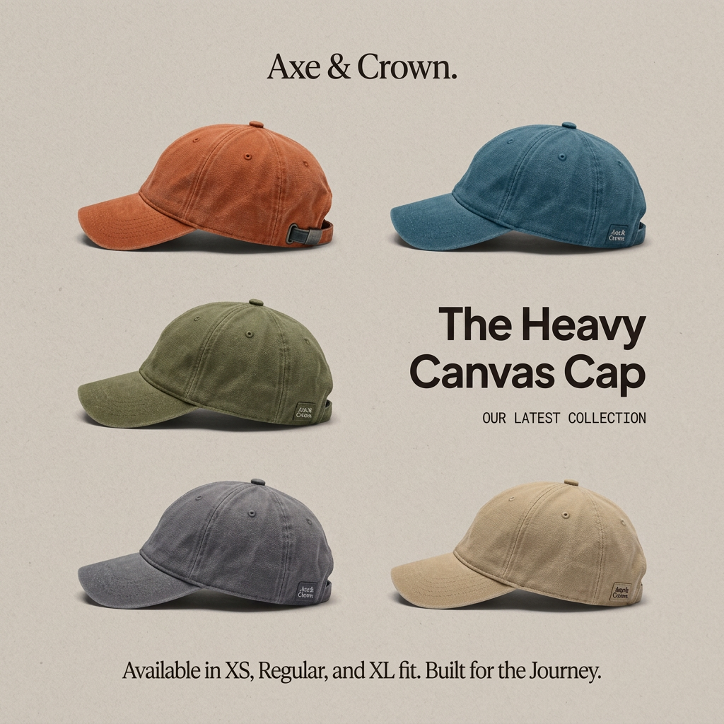
The copy is minimal and functional, with only four text elements. "The Heavy Canvas Cap" names the product and its key material in one line, so viewers know exactly what it is. "Our latest collection" adds newness without hype. The strongest line is the practical one at the bottom: listing XS, Regular and XL addresses fit, which is one of the most common reasons people do not buy caps. "Built for the Journey" closes with an emotional, adventure-flavoured tagline. There is no price or call to action on the image, so the primary text and button must handle conversion.
Visual design
Five caps are arranged in a staggered grid, with the headline block replacing the sixth slot so text and product feel integrated. All caps face the same direction in side profile, which keeps the composition orderly. The beige paper texture and soft shadows give a tactile, printed-catalogue look. Colors are desaturated and harmonious, so no single cap dominates. Typography uses three type styles with clear size steps.
How to adapt this template for your brand
- Photograph every color or variant of your product from the same angle and lighting.
- Arrange them in a grid on a neutral textured background, leaving one slot for the headline.
- Write a headline that names the product and its main material or feature.
- Add one practical line that removes a common objection, such as sizes or fits.
- Finish with a short brand tagline and keep everything else off the image.
Tips for hats ads on Meta
This calm layout works well in Meta feeds and as the first card of a carousel, where each following card can show one colorway up close. Use dynamic product ads with your catalogue so the colors match what people viewed. On Pinterest-style placements the neutral tone fits naturally. Add the price and a clear CTA in the primary text since the image has none.
About this creative
This square product ad from Axe & Crown introduces The Heavy Canvas Cap with a simple colorway lineup. Five six-panel baseball caps in washed rust orange, teal blue, olive green, slate grey and sand are photographed in side profile and arranged in a loose grid on a textured beige paper background. Each cap shows a small woven brand label near the back and soft shadows that add depth. The brand name sits at the top in a classic serif. On the right, a bold sans-serif headline names the product, with a small monospaced line underneath calling it the latest collection. At the bottom, a single serif sentence lists the three fits, XS, Regular and XL, followed by the tagline "Built for the Journey." There are no people, no prices and no visual clutter. The muted palette and generous white space give the ad a calm, premium catalogue feel that lets the colors and texture of the caps sell themselves.
Meta ad · 1200 × 1200 · Hats
Canvas Cap Ad Template: Colorway Lineup Product Shot
This Axe & Crown ad launches a heavy canvas cap by lining up five washed colorways on a neutral paper background. Short copy names the product, flags it as a new collection and highlights three fit sizes. Use this product-shot format to show range and choice for apparel and accessories.
Added
All brand names and logos are property of their owners. Adplaylist is not affiliated with or endorsed by these brands.
Details
Ad copy
Primary text
Meet The Heavy Canvas Cap, our latest collection. 🧢 Five washed colorways, rugged canvas and three fits (XS, Regular and XL) so every head finds the right one. Built for the journey.
Description
Available in XS, Regular and XL fit.
On-image text
Axe & Crown. | The Heavy Canvas Cap | OUR LATEST COLLECTION | Available in XS, Regular, and XL fit. Built for the Journey.
Headline ideas for this template
- 1Five Colors. Three Fits. One Cap.
- 2Finally, a Cap That Fits
- 3Heavy Canvas, Built for the Journey
- 4Pick Your Color: The Heavy Canvas Cap
- 5New: Washed Canvas Caps in XS to XL
Meta image ad specs
| Placement | Ratio | Size (px) |
|---|---|---|
| Feed | 1:1 or 4:5 | 1080×1080 / 1080×1350 |
| Marketplace | 1:1 | 1200×1200 |
| Messenger inbox | 1:1 | 1200×1200 |
| Stories & Reels | 9:16 | 1080×1920 |
This template is 1:1. Request 4:5 or 9:16 to cover all placements.