Key takeaways
- Format: Humorous fake apology text post over a full-bleed product photo.
- Best for: Challenger brands with a clear 'better than the default' story.
- Hook: A cheeky apology headline with a shrug emoji and two exclamation marks.
- Reuse it: Apologise for ruining the old way, then list why your product spoils it.
Available sizes
What is a meme ad?
A meme ad borrows a familiar meme format or internet joke and adapts it to the product or the buyer's problem. It feels native to social feeds and is highly shareable, but depends on the meme still being recognisable to the audience.
See all meme ads →Why this meme ad works
- 01
Humour disarms
A playful 'sorry, not sorry' tone feels human and lowers ad scepticism.
- 02
Flips the competitor
It positions grocery meat as something you can't go back to, without attacking anyone directly.
- 03
Native look
Emoji and casual text make it look like a creator post rather than an ad.
- 04
Proof in the middle
The list of standards sits between the joke and the punchline, so the benefits get read.
Full creative breakdown
Who this ad targets
This ad targets younger, social-native shoppers, mostly millennials and Gen Z adults in the US, who respond to brand personality and meme culture. They care about food quality and transparency but are tired of serious health messaging. It also reaches label-readers who already feel uneasy about supermarket meat, validating that feeling with humour. As a brand-building piece, it works well for cold audiences and for engagement campaigns that grow a warm audience for retargeting.
Copywriting analysis
The copy uses the 'sorry, not sorry' trope. The headline is an apology that is actually a boast, which creates instant intrigue. The supporting line, 'We didn't mean to make you question every label', reframes a pain point as a side effect of quality. The colon introduces the benefits as a short list, keeping the facts scannable. 'OR' and 'ever' in the antibiotics line add emphasis and absolutes. The ellipsis before the closing line slows the pace for the punchline, and 'Sorry about that.' lands with a wink. There is no hard CTA on the image, so the primary text and button must carry the action.
Visual design
The full-bleed raw steak is the background and the brand colour at the same time, filling the frame with rich red. White text with a subtle shadow stays legible on top. Hierarchy comes from size alone: big exclamation marks, bold uppercase headline, then smaller body text and a bold italic closer. The emoji adds a human, mobile-native touch. With no buttons or logos on the image, it relies on the Story CTA sticker for action.
How to adapt this template for your brand
- Name the 'old way' your product makes hard to go back to.
- Write a mock apology headline and add an emoji that fits the tone.
- List three of your strongest standards or benefits in plain language.
- End with a short, cheeky punchline like 'Sorry about that.'
- Place everything over a full-bleed product photo and test it as an organic post first.
Tips for meat ads on Meta
This format thrives in Instagram Stories and Reels where text-on-image posts look native. Because there is no logo on the creative, make sure your brand name is visible in the ad's profile and primary text, or add a small logo for cold audiences. Run it as a brand awareness or engagement ad, then retarget engagers with an offer creative. Test it as a boosted organic post too, since meme-style content often earns more shares and comments.
About this creative
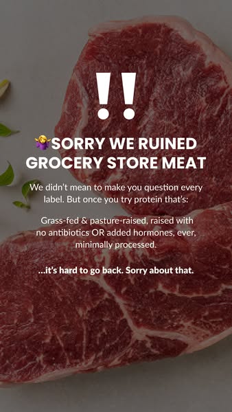
This vertical ad fills the entire frame with a close-up of a raw, deep-red steak on a light background, with a few green herb leaves at the edges. Over the meat, the text reads like a social post. Two large white exclamation marks open the ad, followed by a shrugging-woman emoji and a bold uppercase headline: Sorry we ruined grocery store meat. Below, a smaller paragraph explains, in a mock-apologetic tone, that the brand did not mean to make you question every label. It then lists the standards in a centred block: grass-fed and pasture-raised, no antibiotics or added hormones ever, and minimally processed. The ad closes with a bold italic line saying it is hard to go back, and a final 'sorry about that'. The ad has no logo, button or offer on the image, so it feels like organic content and relies on personality to build brand affinity.
Meta ad · 338 × 600 · Meat
ButcherBox "Sorry We Ruined Grocery Store Meat" Ad
This ButcherBox story ad uses a tongue-in-cheek apology to make supermarket meat feel like a step down. White text over a full-frame raw steak lists the brand's standards, then ends with a playful 'sorry about that'. It is a meme-style, humour-led ad for Meta Stories that sells through attitude rather than offers.
Added
All brand names and logos are property of their owners. Adplaylist is not affiliated with or endorsed by these brands.
Details
Ad copy
Primary text
We'd say sorry, but we're not. 🤷♀️ Once you've tasted grass-fed, pasture-raised meat with no antibiotics or added hormones, the grocery store just hits different. Meat with receipts, straight to your door. No fillers. No shortcuts. No added hormones. No bull.
Description
Grass-fed, pasture-raised, minimally processed
On-image text
!! | 🤷♀️ SORRY WE RUINED GROCERY STORE MEAT | We didn't mean to make you question every label. But once you try protein that's: | Grass-fed & pasture-raised, raised with no antibiotics OR added hormones, ever, minimally processed. | ...it's hard to go back. Sorry about that.
Headline ideas for this template
- 1Sorry, Grocery Store. It's Not You, It's Your Meat.
- 2We Ruined Supermarket Steak (On Purpose)
- 3Warning: You Won't Go Back
- 4Once You Try It, Labels Look Different
- 5Our Apologies To The Meat Aisle
Meta image ad specs
| Placement | Ratio | Size (px) |
|---|---|---|
| Feed | 1:1 or 4:5 | 1080×1080 / 1080×1350 |
| Marketplace | 1:1 | 1200×1200 |
| Messenger inbox | 1:1 | 1200×1200 |
| Stories & Reels | 9:16 | 1080×1920 |
This template is 1:1. Request 4:5 or 9:16 to cover all placements.
Browse similar by tag