Key takeaways
- Format: Side-by-side Old Way versus New Way comparison with matching captions.
- Best for: Products replacing manual, paper-based or legacy processes.
- Hook: The instantly recognisable contrast between clutter and clean automation.
- Reuse it: Show your buyer's current mess on the left and your product on the right.
Available sizes
What is a comparison ad?
A comparison ad sets the product against an alternative, such as a competitor, the old way of doing things or a cheaper option, usually in a two-column layout or table. It helps buyers who are already weighing options see quickly why this one is the better choice.
See all comparison ads →Why this comparison ad works
- 01
Instant before and after
The split layout needs no explanation. Viewers grasp the upgrade in a second, even without reading the copy.
- 02
Parallel three-word captions
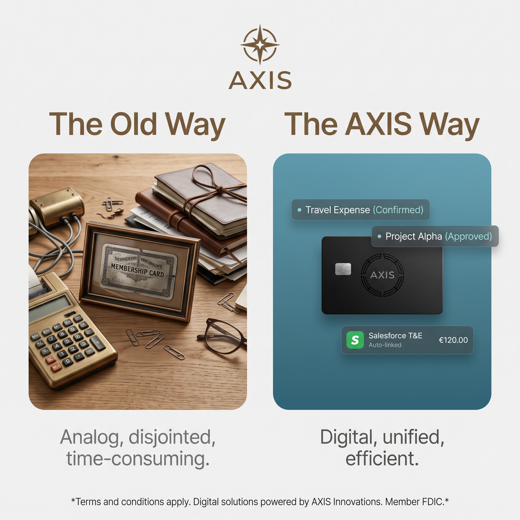
Analog, disjointed, time-consuming mirrors digital, unified, efficient. The matching rhythm makes the contrast memorable.
- 03
Premium product styling
The matte black card and bronze typography feel exclusive. It positions AXIS as a premium alternative, not a budget tool.
- 04
Proof via UI tags
Confirmed, Approved and Auto-linked tags show automation happening. They make the abstract benefit concrete.
Full creative breakdown
Who this ad targets
The ad targets finance managers, business owners and operations leads at small and mid-sized companies that still rely on spreadsheets, paper receipts and manual approvals for company spending. The Salesforce T&E reference and project-based tags suggest teams with travelling staff and project accounting needs. The premium black card and bronze tones also appeal to executives who want a modern business card that reflects a professional image.
Copywriting analysis
The copy is minimal and structured around contrast. "The Old Way" and "The AXIS Way" are simple parallel headings that put the brand name directly into the solution. The captions use two sets of three adjectives, a rule-of-three pattern that is easy to remember: each negative word on the left has a positive opposite on the right. The UI tags add microcopy that reads like real product states, which builds credibility. The disclaimer handles legal requirements, but mixing a US FDIC reference with euro amounts may confuse viewers about which market the product serves, so the currency should match the target market.
Visual design
The layout is symmetrical, with two rounded image panels of equal size. The left uses warm wood, brass and leather tones with detailed, cluttered photography, while the right uses a cool teal gradient, a dark card and frosted-glass UI elements, so colour temperature alone tells the story. Bronze headlines and the compass logo tie both sides together. Light-grey captions and a neutral background keep the focus on the two panels.
How to adapt this template for your brand
- Photograph or stage the outdated way your audience currently works.
- Create a clean product visual with UI tags showing key automated states.
- Place them side by side with parallel headings naming the old way and your way.
- Write two matching sets of three adjectives as captions.
- Use warm tones for the old way and cool tones for the new way.
Tips for finance & fintech ads on Meta
Comparison ads perform well in both LinkedIn and Meta feeds because they read at a glance. On LinkedIn, target finance and operations roles at SMBs; on Meta, use small-business owner and business-traveller interests. A two-frame video that wipes from the old way to the AXIS way can lift engagement. Keep the disclaimer legible and align the currency shown with the market you're targeting.
About this creative
This square AXIS ad uses a split-screen comparison to sell a corporate card and expense management product. The AXIS logo, a bronze compass star with a serif-style wordmark, sits at the top centre. Two bronze headlines divide the ad: "The Old Way" on the left and "The AXIS Way" on the right. The left panel shows a warm, cluttered wooden desk with a brass adding machine, leather ledgers tied with string, a framed vintage membership card, paper clips and old glasses, evoking slow, analog bookkeeping. The right panel is a clean teal-blue gradient with a matte black AXIS card in the centre, surrounded by glassy UI tags: "Travel Expense (Confirmed)", "Project Alpha (Approved)" and a Salesforce T&E entry auto-linked at €120.00. Under each panel, grey captions summarise the contrast: analog, disjointed, time-consuming versus digital, unified, efficient. A small disclaimer at the bottom mentions terms and conditions and FDIC membership.
Meta ad · 1200 × 1200 · Finance & Fintech
AXIS Old Way vs New Way Ad: Comparison Example
This AXIS ad uses a side-by-side Old Way versus New Way comparison to sell a digital corporate card and expense platform. A cluttered vintage desk contrasts with a clean card surrounded by approval badges. Use it as a template for any product that replaces outdated manual processes with automation.
Added
All brand names and logos are property of their owners. Adplaylist is not affiliated with or endorsed by these brands.
Details
Ad copy
Primary text
Still matching receipts by hand and chasing approvals over email? AXIS combines a smart corporate card with automatic expense linking and approvals, so every purchase is categorised and approved the moment it happens.
Description
Digital, unified, efficient business spending
On-image text
AXIS | The Old Way | The AXIS Way | Travel Expense (Confirmed) | Project Alpha (Approved) | Salesforce T&E Auto-linked €120.00 | Analog, disjointed, time-consuming. | Digital, unified, efficient. | *Terms and conditions apply. Digital solutions powered by AXIS Innovations. Member FDIC.*
Headline ideas for this template
- 1Your expenses, finally out of the drawer
- 2Swap paperwork for one smart card
- 3Every expense approved as you spend
- 4Upgrade from ledgers to AXIS
- 5Expense management, the modern way
Meta image ad specs
| Placement | Ratio | Size (px) |
|---|---|---|
| Feed | 1:1 or 4:5 | 1080×1080 / 1080×1350 |
| Marketplace | 1:1 | 1200×1200 |
| Messenger inbox | 1:1 | 1200×1200 |
| Stories & Reels | 9:16 | 1080×1920 |
This template is 1:1. Request 4:5 or 9:16 to cover all placements.