Key takeaways
- Format: Offer ad with a white text panel above a hero product on black
- Best for: Free gift with purchase promotions and limited-time deals
- Hook: A product pun that doubles as an excitement cue
- Reuse it: Write a pun on your product, then put the free gift number in the biggest type
Available sizes
What is an offer ad?
An offer ad leads with a deal, such as a percentage off, free shipping or a first-order discount, as the main hook. It's built to convert people who already know the brand or are close to buying, and works best with a clear deadline or condition.
See all offer / discount ads →Why this offer / discount ad works
- 01
Pun earns attention
'Hold on to your buns' plays on 'hold on to your hats' and burger buns. Humor makes people pause and remember the ad.
- 02
The number is the hero
'16 FREE' is the heaviest text in the frame. The value is clear before viewers read anything else.
- 03
High contrast
A white box on black is impossible to miss in a busy feed. It also keeps text readable on any phone screen.
- 04
One product, one message
There is just one burger and one offer. The simple layout reduces thinking and speeds up the decision.
Full creative breakdown
Who this ad targets
This ad targets US burger fans, grillers and families aged 25 to 55 who enjoy casual comfort food and respond to free deals. The playful tone suits younger and humor-loving audiences, while the free gift appeals to value seekers. It works for cold prospecting with interests like burgers, grilling, BBQ and fast casual dining, and for retargeting people who visited the site but did not buy. It can also reactivate lapsed customers with a low-risk reason to come back.
Copywriting analysis
The copy has three lines and three weights. "Hold on to your buns" is a twist on the idiom 'hold on to your hats,' signalling something exciting while referencing the bun on screen. It is light and playful, written in thin type so it does not dominate. "16 FREE" is the core message, set in the heaviest weight for instant value. "SMASH BURGERS" names the product with a trendy food term that suggests crispy, restaurant-style burgers. There is no price, condition or brand name on the image, which keeps it clean, though the primary text should handle details like 'with purchase.'
Visual design
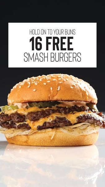
The design is split into two zones: a white text box at the top and the burger below on a black, glossy surface. This high-contrast layout makes both the copy and the food pop. Studio lighting creates highlights on the bun and melted cheese, and the reflection adds a premium, advertising-quality finish. The condensed sans serif typeface varies in weight to create hierarchy. Plenty of black space around the burger keeps the frame uncluttered and focused.
How to adapt this template for your brand
- Write a pun that connects a common phrase to your product.
- Place a solid white text panel in the top third of a dark background.
- Set your free gift number in the heaviest weight, product name lighter.
- Photograph one hero product on a reflective black surface with studio lighting.
- Keep the image free of extra badges and put conditions in the primary text.
Tips for meat ads on Meta
On Meta, the white panel sits nicely below the Stories safe zone, but check that it does not overlap the account name. Because the image has no logo, include the brand name early in the primary text or add a small logo for brand recall. In Feed, crop to 4:5 and keep the box and burger together. Test this pun version against a straight 'Get 16 Free Smash Burgers' headline to see whether humor lifts click-through for your audience.
About this creative
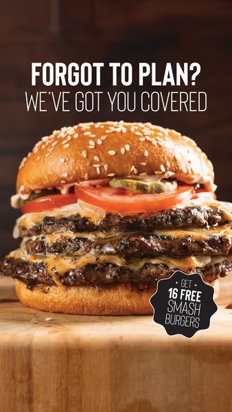
This vertical ad uses a moody black background with a glossy, reflective surface at the bottom. Center stage is a double smash cheeseburger: a shiny sesame brioche bun, pickles, pinkish sauce, two crispy-edged patties draped in orange melted cheese and shredded lettuce on the bottom bun. A soft reflection appears beneath it, giving a premium studio feel. In the upper third, a large white rectangle holds all of the copy. The first line, in thin condensed capitals, reads "HOLD ON TO YOUR BUNS." Below, in very heavy black type, comes "16 FREE," followed by "SMASH BURGERS" in a lighter weight. The white box contrasts sharply with the black background, so the offer reads instantly. There is no extra badge, logo or packaging. Everything focuses on one burger and one deal, delivered with a playful pun that makes the offer memorable while keeping the design clean and premium.
Meta ad · 338 × 600 · Meat
Omaha Steaks 'Hold On To Your Buns' Free Gift Ad: Pun-Powered Offer Creative
This Omaha Steaks offer ad leads with a pun, 'Hold on to your buns,' and a bold free gift: 16 smash burgers. A glossy double cheeseburger sits on a reflective black surface below a white text box. Use this format to promote gift-with-purchase deals with humor and maximum clarity on Meta.
Added
All brand names and logos are property of their owners. Adplaylist is not affiliated with or endorsed by these brands.
Details
Ad copy
Primary text
Hold on to your buns – for a limited time, get 16 FREE smash burgers with your order. Crispy edges, juicy centers and ready for the grill. Stock up while the deal lasts!
Description
Limited-time free gift with purchase
On-image text
HOLD ON TO YOUR BUNS | 16 FREE | SMASH BURGERS
Headline ideas for this template
- 1Smash Deal Alert: 16 Free Burgers
- 2Free Burgers? Don't Mind If We Do
- 3Big Flavor, Bigger Bonus: 16 Free
- 4Crispy Edges. Juicy Centers. Totally Free.
- 5Your Grill Called – It Wants 16 Free Burgers
Meta image ad specs
| Placement | Ratio | Size (px) |
|---|---|---|
| Feed | 1:1 or 4:5 | 1080×1080 / 1080×1350 |
| Marketplace | 1:1 | 1200×1200 |
| Messenger inbox | 1:1 | 1200×1200 |
| Stories & Reels | 9:16 | 1080×1920 |
This template is 1:1. Request 4:5 or 9:16 to cover all placements.
Browse similar by tag