Key takeaways
- Format: Carousel opener with feature callouts on a real app screen.
- Best for: Launching a new product, feature or use case.
- Hook: Introducing in red above a giant product name.
- Reuse it: Show your real interface with live data next to the person using it.
Available sizes
What is a feature callout ad?
A feature callout ad is a static image that shows a single product with short text labels pointing to its key features or benefits, usually joined to the product by thin lines. It explains several selling points at a glance without a long caption, which is why it's common for supplements, skincare, electronics and kitchenware.
See all feature callouts ads →Why this feature callouts ad works
- 01
News framing
Introducing signals something new, which earns attention from existing fans and curious newcomers alike.
- 02
Real data as proof
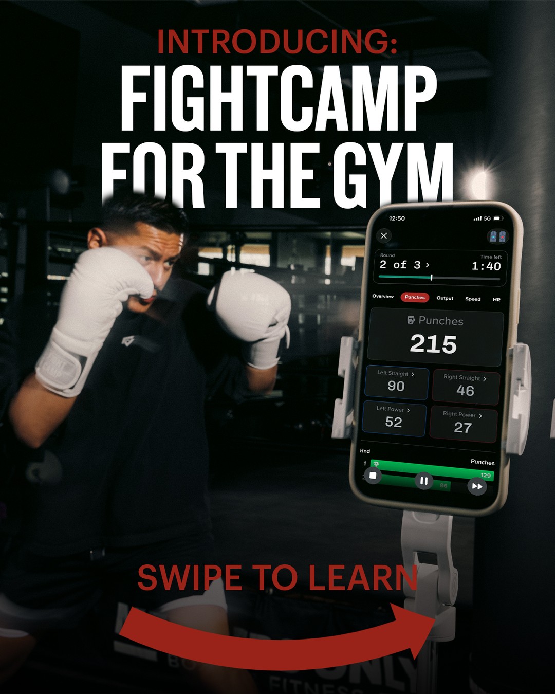
Actual punch counts and round info show exactly what the product does without needing a feature list.
- 03
Clear swipe cue
The big red arrow and Swipe to Learn push viewers into the carousel, raising engagement.
- 04
Layered depth
The headline tucks behind the boxer's head, giving the ad a premium, editorial look that stands out in feed.
Full creative breakdown
Who this ad targets
This ad targets regular gym-goers and boxing fans who train on heavy bags and want measurable progress. Many are tech-savvy adults aged 22 to 45 who already use fitness trackers or apps. Existing FightCamp home users are also a key audience, since the gym version extends a product they know. It works for interest targeting around boxing, HIIT and wearables, plus custom audiences of current subscribers.
Copywriting analysis
The copy uses classic launch language. Introducing primes the reader for news, and the red colour separates it from the headline. FightCamp for the Gym is clear and descriptive, telling existing fans that a home product now works in a new place. The phrase is short enough to set in huge type. Swipe to Learn is a direct instruction that sets expectations: more detail awaits on the next card. The app screen acts as secondary copy, communicating features like round tracking, punch types and power without extra words. The approach keeps the main card simple and moves the explaining into the rest of the carousel.
Visual design
The portrait layout stacks a huge headline at the top, the boxer and phone in the middle, and the swipe prompt at the bottom. The dark, desaturated gym makes the white gloves, white text and bright phone screen pop. The phone is placed right of center, slightly overlapping the scene, so it reads as the hero product. Red is used only for Introducing, the swipe text and arrow, guiding the eye top to bottom and right.
How to adapt this template for your brand
- Start the headline with Introducing or New to frame it as news.
- Show a real product screen with believable live data.
- Place a person using the product beside the screen for context.
- Add a bold swipe arrow and a short Swipe to Learn prompt at the bottom.
- Use following carousel cards to explain features, pricing and setup.
Tips for boxing ads on Meta
On Meta and Instagram, this 4:5 portrait card is ideal as the first frame of a carousel in Feed, where it takes up more screen space than a square. Keep the swipe cue only on the first card. Upload existing customers as a custom audience to announce the launch, then expand to lookalikes. Use the Learn More button and link to a launch landing page. Test a Reels version with the screen updating live.
About this creative
This portrait ad is the first card of a FightCamp carousel announcing FightCamp for the Gym. A boxer in a black shirt and white gloves holds his guard in a dark, moody gym. To his right, a smartphone in a white mount displays the FightCamp app mid-workout: Round 2 of 3, 1:40 left, and a large Punches count of 215, with tiles for Left Straight, Right Straight, Left Power and Right Power, plus a round progress bar. At the top, the word Introducing appears in red, followed by FightCamp for the Gym in huge white condensed letters that partly overlap the boxer's head for depth. At the bottom, red Swipe to Learn text sits above a large curved red arrow pointing right. The ad combines a launch announcement, product proof via real interface data and a clear interaction cue that encourages viewers to swipe through the carousel.
Meta ad · 338 × 600 · Boxing
Boxing Tracker Ad Template: Introducing FightCamp for the Gym
This FightCamp ad announces a new product use case with a carousel opener: a boxer training beside a phone showing live punch stats. Feature callouts on the real app screen and a swipe prompt make it a useful template for fitness tech and app launches on Meta and Instagram.
Added
All brand names and logos are property of their owners. Adplaylist is not affiliated with or endorsed by these brands.
Details
Ad copy
Primary text
FightCamp now works at your gym. Clip on the trackers, mount your phone and see every punch, round and power shot in real time. Train anywhere and track everything. Swipe to see how it works.
Description
Track punches, rounds and power anywhere you train
On-image text
INTRODUCING: FIGHTCAMP FOR THE GYM | SWIPE TO LEARN | App screen: Round 2 of 3, Time left 1:40, Overview, Punches, Output, Speed, HR, Punches 215, Left Straight 90, Right Straight 46, Left Power 52, Right Power 27, Rnd, 129
Headline ideas for this template
- 1Your Gym Just Got Smarter
- 2Track Every Round, Wherever You Train
- 3FightCamp Has Left the Living Room
- 4Bring Your Punch Stats to the Gym
- 5Now Every Bag Session Counts
Meta image ad specs
| Placement | Ratio | Size (px) |
|---|---|---|
| Feed | 1:1 or 4:5 | 1080×1080 / 1080×1350 |
| Marketplace | 1:1 | 1200×1200 |
| Messenger inbox | 1:1 | 1200×1200 |
| Stories & Reels | 9:16 | 1080×1920 |
This template is 1:1. Request 4:5 or 9:16 to cover all placements.