Key takeaways
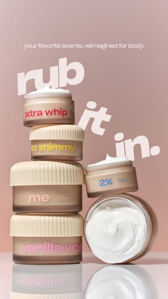
- Format: Stacked product tower with type woven between items
- Best for: Launching a multi-scent beauty or body care range
- Hook: Three-word cheeky instruction: rub it in
- Reuse it: Stack any SKUs and weave the headline through them
Available sizes
What is a product shot ad?
A product shot ad puts the product itself at the centre of the frame, usually on a clean or styled background with little text. It works best when the packaging or product is distinctive enough to stop the scroll and the viewer already understands what it does.
See all product shot ads →Why this product shot ad works
- 01
Variety in one frame
The stack shows five scents at once without feeling like a catalogue grid.
- 02
Type with depth
Letters tucked behind jars create a layered, editorial look that stops the scroll.
- 03
Texture reveal
Open jars of whipped cream show the product's feel, which matters for body care.
- 04
Playful double meaning
'Rub it in' is both a usage instruction and a cheeky brag about the launch.
Full creative breakdown
Who this ad targets
This ad reaches existing Snif fragrance fans and body-care shoppers, mainly women 18–35, who like matching their body products to their perfume. They enjoy fun, colourful packaging, buy multiple scents to layer, and discover beauty products through TikTok and Instagram creators. The soft pink palette and playful type also attract Gen Z shoppers who want affordable self-care that feels giftable and photo-friendly on a shelf.
Copywriting analysis
The headline is only three words, but it works hard. 'Rub it in' tells you how to use the product, hints at the whipped texture and carries a cheeky 'we told you so' attitude that fits the brand. The supporting line explains the launch clearly: your favourite scents, reimagined for body. 'Favourite' speaks directly to existing fans, and 'reimagined' signals something new without technical claims. Scent names printed big on each jar – extra whip, coco shimmy, vanilla vice – act as secondary copy, adding personality and showing range without listing anything in text.
Visual design
The soft pink background lets the coloured labels pop while keeping everything gentle and beauty-coded. The off-balance stack and diagonal headline create energy and lead the eye from top left to bottom right. Placing letters behind jars is a simple but effective depth trick. The reflective floor adds polish, and the open jars on the right balance the taller left stack.
How to adapt this template for your brand
- Stack three to six of your products into an uneven tower, mixing open and closed packs.
- Pick a soft single-colour background that makes your labels stand out.
- Write a short, playful headline that doubles as a usage cue.
- Set the headline large and weave it behind and between the products.
- Add a small explainer line at the top for the launch context.
Tips for body care ads on Meta
Made for Instagram and Facebook Stories and Reels at 9:16. Keep the top explainer line below the profile bar and the stack clear of the bottom CTA area. For feed, crop to 4:5 around the stack. This layout also works as a carousel cover, followed by one slide per scent. Target past fragrance buyers and lookalikes of body-care purchasers, and use a Shop Now CTA.
About this creative
Against a dusty pink gradient, five Snif body whip jars are stacked into an uneven tower. From top to bottom the left stack shows extra whip, coco shimmy, me and vanilla vice, each with a cream ribbed lid and a frosted jar printed in a different bright colour. On the right, a smaller jar labelled 2% sits open on top of a larger open jar of fluffy white cream, showing the whipped texture. A glossy surface reflects the jars below. The main headline, rub it in., is set in huge, heavy white lowercase letters that weave diagonally through the stack, partly tucked behind the jars, which adds depth and movement. A small line at the top explains that these are your favourite scents, reimagined for body. The mix of open and closed jars shows both packaging and texture, while the scent names doubling as product names make it clear this is an extension of the fragrance line.
Meta ad · 338 × 600 · Body Care
Body Cream Ad: Snif Body Whips Stacked Under 'Rub It In'
This Snif story ad launches a body whip range by stacking five scented jars against a soft pink backdrop. The big headline, rub it in, tumbles diagonally between the jars. Use it as a template for multi-SKU beauty ranges, product extensions or any collection where you want to show variety in one image.
Added
All brand names and logos are property of their owners. Adplaylist is not affiliated with or endorsed by these brands.
Details
Ad copy
Primary text
Your favourite Snif scents, reimagined for body. 🤍 Whipped, fluffy body cream in Extra Whip, Coco Shimmy, Vanilla Vice and more. Rub it in.
Description
Your favourite scents, reimagined for body
On-image text
your favorite scents, reimagined for body. rub it in. | Jars: extra whip, coco shimmy, me, vanilla vice, 2%
Headline ideas for this template
- 1Your perfume, now in a jar
- 2Whipped scents for your whole body
- 3Layer it on, rub it in
- 4Smell good from head to toe
- 5Five scents, one tall order
Meta image ad specs
| Placement | Ratio | Size (px) |
|---|---|---|
| Feed | 1:1 or 4:5 | 1080×1080 / 1080×1350 |
| Marketplace | 1:1 | 1200×1200 |
| Messenger inbox | 1:1 | 1200×1200 |
| Stories & Reels | 9:16 | 1080×1920 |
This template is 1:1. Request 4:5 or 9:16 to cover all placements.
Browse similar by tag