Key takeaways
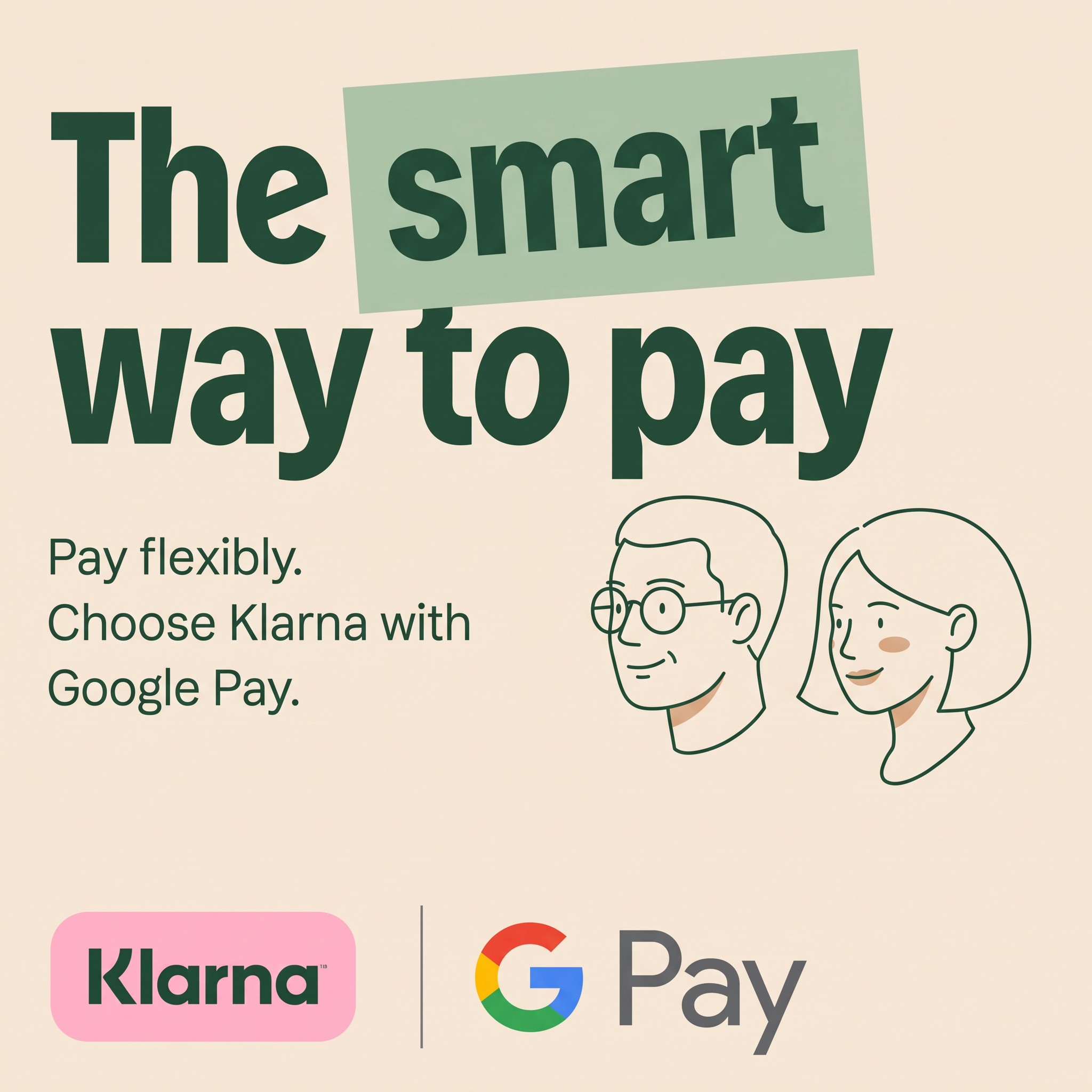
- Format: Bold typographic headline with a highlighted keyword and co-branded logo strip.
- Best for: Consumer fintech partnerships and payment feature announcements.
- Hook: One highlighted word, smart, that reframes paying later as a clever choice.
- Reuse it: Highlight the single most persuasive word in your headline with a tilted colour block.
Available sizes
What is a lifestyle ad?
A lifestyle ad shows the product being used in a real setting by the kind of person who buys it. Instead of listing features, it sells the feeling or outcome of owning the product, which makes it a strong fit for fashion, home, travel and wellness brands.
See all lifestyle ads →Why this lifestyle ad works
- 01
One word does the persuading
Highlighting "smart" positions flexible payment as a savvy decision. It quietly counters the perception that BNPL is irresponsible.
- 02
Two trusted logos
Pairing Klarna with Google Pay borrows trust from a household name. Viewers immediately understand where and how the feature works.
- 03
Friendly, human illustration
Line-drawn faces feel approachable and inclusive. They make a payment feature feel personal without needing stock photography.
- 04
Readable at thumb-scroll speed
The headline is huge and the copy is under fifteen words. The message lands in a second, even on small screens.
Full creative breakdown
Who this ad targets
The ad targets everyday online shoppers, mainly younger adults aged roughly 18 to 40, who already use Google Pay on Android or in Chrome and like the idea of spreading payments. Many will know Klarna from fashion and electronics checkouts. The friendly, low-pressure tone also speaks to people who are curious about BNPL but cautious, reassuring them that it is a sensible, integrated payment option rather than a risky loan product.
Copywriting analysis
The headline "The smart way to pay" is short, rhythmic and benefit-led, but its real power is the visual emphasis on "smart", which reframes paying in instalments as an intelligent choice rather than an impulse. The supporting copy is split into two short sentences: "Pay flexibly" states the benefit, and "Choose Klarna with Google Pay" gives the instruction, telling the reader exactly what action to take at checkout. There is no jargon, no mention of interest or terms on the image, which keeps it light, though the primary text and landing page must carry the required credit disclosures. The copy relies on the two brand names for credibility instead of claims or numbers.
Visual design
The design uses a warm beige background with deep forest-green type, a sage-green highlight block and Klarna's signature pink badge. The tilted highlight breaks the grid and adds personality. Heavy, condensed sans-serif type creates impact, while the lighter body text keeps hierarchy clear. Minimal line-art faces use a single stroke colour with small skin-tone accents. The logo strip at the bottom acts as a sign-off and keeps both brands visible.
How to adapt this template for your brand
- Write a short benefit headline and choose one word to highlight.
- Place that word on a slightly tilted colour block in a secondary brand colour.
- Add one or two simple line illustrations of your typical customers.
- Explain the action in two short sentences: benefit first, then how.
- Close with a logo strip if you have a partner, separated by a thin divider.
Tips for finance & fintech ads on Meta
On Meta and TikTok, use this as a static in-feed ad or animate the highlight block sliding in behind "smart" for a short video version. On Google, adapt it for Display and Discovery placements targeting Android users and shopping audiences. Keep the logo strip in the safe zone so platform UI doesn't cover it. Make sure the primary text or landing page includes the credit and late-fee disclosures required in each market.
About this creative
This square co-branded ad from Klarna and Google Pay promotes the option to pay with Klarna through Google Pay. The headline "The smart way to pay" fills the top half in heavy dark-green type. The word "smart" sits on a slightly tilted sage-green rectangle, like a highlighter or sticker, which draws the eye and adds a hand-made feel. Below, a short supporting line explains the offer: pay flexibly by choosing Klarna with Google Pay. On the right, two simple line-art faces, a man with round glasses and a woman with a bob, smile toward the text, giving the ad warmth and a relatable, everyday-shopper feel. The bottom strip holds the two logos side by side: Klarna's pink badge and the multicolour Google Pay mark, separated by a thin vertical line. The warm beige background and limited palette keep the ad clean, friendly and instantly recognisable as Klarna.
Meta ad · 1200 × 1200 · Finance & Fintech
Klarna x Google Pay Ad: Bold Type Partnership Example
This Klarna and Google Pay ad announces a payment partnership to everyday shoppers. A bold headline with one highlighted word, two friendly line-drawn faces and both logos do all the work. Use it as a template for consumer fintech partnerships or any simple feature launch that needs instant brand recognition.
Added
All brand names and logos are property of their owners. Adplaylist is not affiliated with or endorsed by these brands.
Details
Ad copy
Primary text
Want to spread the cost of your next purchase? Choose Klarna at checkout with Google Pay and pay in flexible instalments. It's quick, simple and right where you already pay.
Description
Choose Klarna at Google Pay checkout
On-image text
The smart way to pay | Pay flexibly. Choose Klarna with Google Pay. | Klarna | G Pay
Headline ideas for this template
- 1Pay your way with Klarna
- 2Split it. Tap it. Done.
- 3Flexible payments, now in Google Pay
- 4Shop now, spread the cost
- 5Checkout just got smarter
Meta image ad specs
| Placement | Ratio | Size (px) |
|---|---|---|
| Feed | 1:1 or 4:5 | 1080×1080 / 1080×1350 |
| Marketplace | 1:1 | 1200×1200 |
| Messenger inbox | 1:1 | 1200×1200 |
| Stories & Reels | 9:16 | 1080×1920 |
This template is 1:1. Request 4:5 or 9:16 to cover all placements.