Key takeaways
- Format: In-context product shot with diagonal stat bubbles
- Best for: Products where fit and installation are key purchase questions
- Hook: 'Introducing Classic 4.0' – new version news with visible fit
- Reuse it: Show your product installed, then float your key stats beside it
Available sizes
What is a feature callout ad?
A feature callout ad is a static image that shows a single product with short text labels pointing to its key features or benefits, usually joined to the product by thin lines. It explains several selling points at a glance without a long caption, which is why it's common for supplements, skincare, electronics and kitchenware.
See all feature callouts ads →Why this feature callouts ad works
- 01
Shows real-world fit
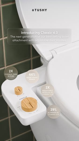
Seeing the attachment on a normal toilet removes doubt about compatibility. Buyers can picture it in their bathroom.
- 02
Stat bubbles guide the eye
The diagonal row of circles leads the viewer down the frame. Each bubble delivers one measurable reason to buy.
- 03
Design-forward setting
Green tiles and bamboo knobs suggest a stylish, premium bathroom. It counters the idea that bidets look clinical.
- 04
Upgrade credibility
Comparing directly with Classic 3.0 shows real progress. It gives loyal customers a specific reason to upgrade.
Full creative breakdown
Who this ad targets
First-time bidet buyers in the US who want to see exactly how an attachment fits on their existing toilet, as well as Classic 3.0 owners considering an upgrade. The audience is typically aged 25–50, design-conscious and practical. Renters and homeowners who want a no-plumber solution will respond to the installed view. Spec-driven shoppers appreciate the clear comparative stats.
Copywriting analysis
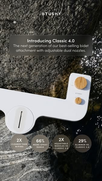
The copy is identical to the rock version, which makes it a clean visual A/B test. 'Introducing Classic 4.0' is a launch-style headline that signals improvement through the version number. The supporting line packs best-seller status and the headline feature into one sentence. Stats follow a consistent big-number-plus-label pattern for scannability. Comparisons with Classic 3.0 are specific and credible, while '2X cleaner than wiping' speaks to those who have never used a bidet.
Visual design
The tight crop on the toilet seat and attachment keeps the product large and detailed. Dark green tiles provide a rich, contrasting backdrop that makes the white product and bamboo knobs pop. Soft natural lighting adds a premium, editorial feel. Four translucent taupe circles are placed on a diagonal, creating flow and visual rhythm. The frosted headline card ensures readability without blocking the product.
How to adapt this template for your brand
- Photograph your product installed or in use in a stylish real setting.
- Announce the release with 'Introducing [product] [version]'.
- Write one line combining best-seller status and the main new feature.
- Place four comparative stats in translucent circles along a diagonal.
- Run it alongside an abstract or texture-based version to test context versus mood.
Tips for bathroom ads on Meta
Pair this creative with the rock-and-water version in the same ad set to let Meta optimise between context and mood. The installed view usually works better for cold audiences who need to understand fit. On Stories, keep the bottom stat bubble above the reply bar. Add a short primary text line about 10-minute installation. A video version showing the install in fast-forward could extend this concept.
About this creative
This version of the Classic 4.0 launch shows the bidet attachment installed on a white toilet, photographed close-up from above at an angle. The attachment's white panel and two bamboo knobs – a large one for pressure and a small one for nozzle selection – sit at the side of the seat. Dark green subway tiles with brass grout lines fill the background, adding a rich, design-forward feel. A frosted card at the top carries the headline 'Introducing Classic 4.0' and the line about the next generation of the best-selling attachment with adjustable dual nozzles. Four translucent taupe circles float diagonally down the frame, each with a stat: 2X cleaner than wiping, 66% more spray range, 2X adjustable nozzles vs Classic 3.0 and 29% slimmer vs Classic 3.0. Compared with the rock-and-water version, this one answers the practical question 'What does it look like on my toilet?' while keeping the same upgrade stats.
Meta ad · 338 × 600 · Bathroom
TUSHY Classic 4.0 Installed Ad: Feature Callout Example
This TUSHY story ad shows the Classic 4.0 bidet attachment fitted to a white toilet against dark green tiles, with four stat bubbles floating diagonally beside it. It is the in-context version of the Classic 4.0 launch. Use it as a template when buyers need to see how a product fits before they buy.
Added
All brand names and logos are property of their owners. Adplaylist is not affiliated with or endorsed by these brands.
Details
Ad copy
Primary text
Introducing TUSHY Classic 4.0 – the next generation of our best-selling bidet attachment. Adjustable dual nozzles, 66% more spray range and 29% slimmer. Fits your existing toilet in minutes.
Description
66% more spray range. 29% slimmer.
On-image text
TUSHY | Introducing Classic 4.0 | The next generation of our best-selling bidet attachment with adjustable dual nozzles. | 2X cleaner than wiping | 66% more spray range | 2X adjustable nozzles vs Classic 3.0 | 29% slimmer vs. Classic 3.0
Headline ideas for this template
- 1Introducing Classic 4.0
- 2See How It Fits Your Toilet
- 366% More Spray Range
- 4Your Best-Seller, Upgraded
- 52X Cleaner Than Wiping
Meta image ad specs
| Placement | Ratio | Size (px) |
|---|---|---|
| Feed | 1:1 or 4:5 | 1080×1080 / 1080×1350 |
| Marketplace | 1:1 | 1200×1200 |
| Messenger inbox | 1:1 | 1200×1200 |
| Stories & Reels | 9:16 | 1080×1920 |
This template is 1:1. Request 4:5 or 9:16 to cover all placements.