Key takeaways
- Format: Split-screen flat lay comparing two use cases around one product.
- Best for: Multi-use bags, apparel and gear for hybrid lifestyles.
- Hook: Adventure on the left, work on the right — one bag in the middle.
- Reuse it: Split your flat lay into two use cases and centre your product.
Available sizes
What is a comparison ad?
A comparison ad sets the product against an alternative, such as a competitor, the old way of doing things or a cheaper option, usually in a two-column layout or table. It helps buyers who are already weighing options see quickly why this one is the better choice.
See all comparison ads →Why this comparison ad works
- 01
Versatility at a glance
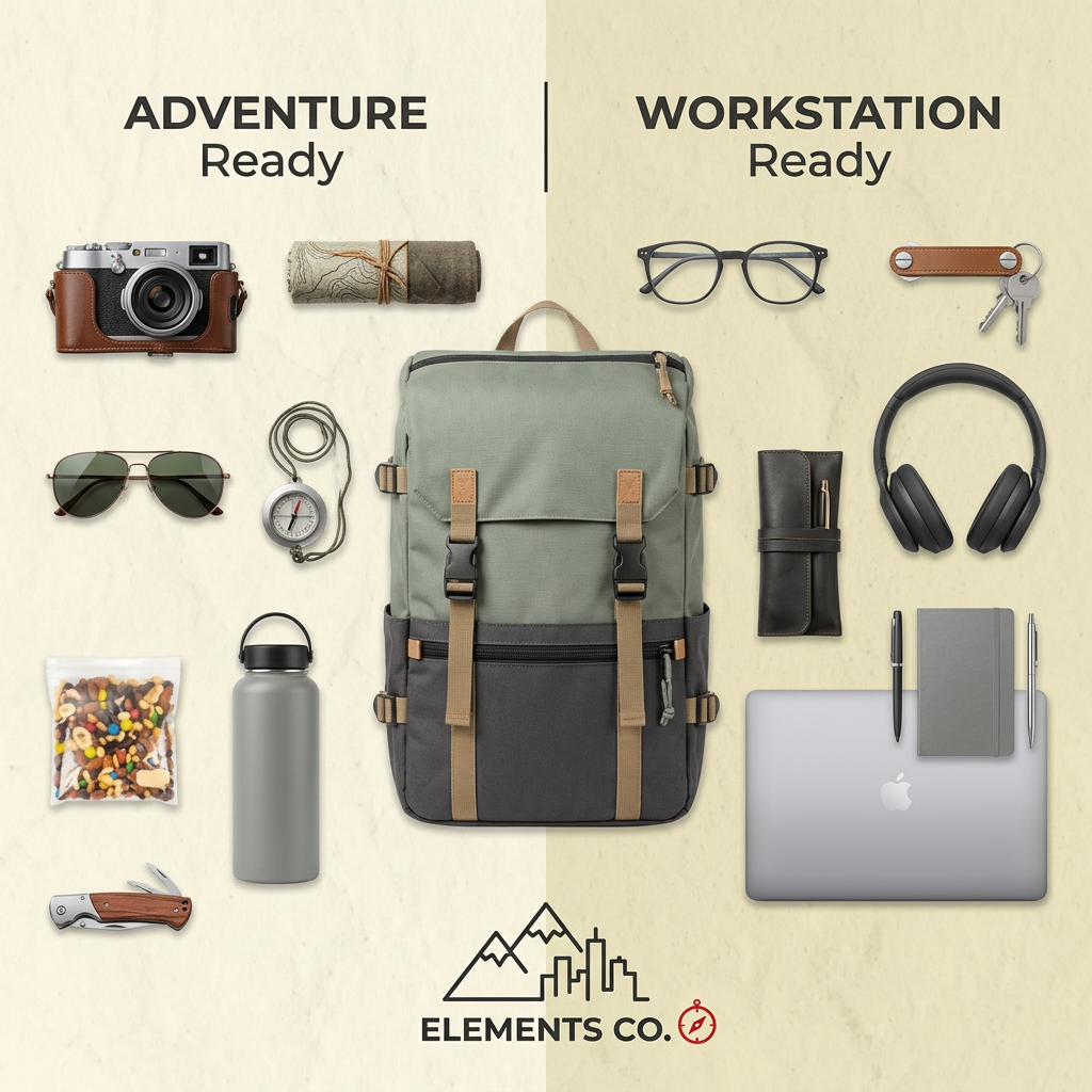
The split layout shows two use cases instantly. Viewers understand the bag works for both without reading copy.
- 02
Satisfying flat lay
Neatly arranged items are visually pleasing and invite longer viewing. Flat lays perform well in lifestyle feeds.
- 03
Identity mirroring
People see their own weekday and weekend selves. The ad speaks to hybrid workers who don't want two bags.
- 04
Logo reinforces the idea
Mountains and city skyline in the logo echo the two halves. Brand and message are perfectly aligned.
Full creative breakdown
Who this ad targets
This ad targets hybrid professionals and creatives aged 24 to 40 who split their time between office work and outdoor activities such as hiking, photography and travel. They want one bag that looks good in a meeting and survives a trail. The creative suits interest audiences around outdoor recreation, photography, remote work and travel, and works well for both prospecting and retargeting because the concept is instantly clear.
Copywriting analysis
On-image copy is limited to two parallel labels: “Adventure Ready” and “Workstation Ready”. The repeated word “Ready” creates rhythm and links both halves to the same promise of preparedness. Bold capitals for “Adventure” and “Workstation” emphasise the contrast, while the lighter “Ready” beneath ties them together. The brand name at the bottom completes the message. Because the items tell the story, the copy can remain minimal. Supporting primary text should add the concrete features that make the dual use possible, such as a padded laptop sleeve, water-resistant fabric and quick-access side pockets.
Visual design
A warm cream background with a subtle split creates two zones without harsh contrast. Items are arranged with even spacing in a symmetrical grid around the central backpack, which is the largest and most colourful object. Muted tones — sage, charcoal, tan, grey and silver — keep the palette cohesive. Shadows are soft and consistent, giving a realistic, tactile feel. A thin vertical line between the labels reinforces the comparison.
How to adapt this template for your brand
- Pick two contrasting use cases your product genuinely serves.
- Gather five to seven items that clearly represent each use case.
- Split your background and centre the product as the largest object.
- Add short parallel labels to each half, repeating one key word.
- Keep the palette muted so the product stands out.
Tips for fashion & apparel ads on Meta
On Meta, this flat lay performs well as a Feed image and as the first card of a carousel where each following card shows a packed version of the bag. Use primary text that names both use cases in the first line. On TikTok, recreate it as a packing video where items slide into the bag from each side, ending on the split flat lay. Test variants with different pairs of use cases, such as travel versus gym.
About this creative
This Elements Co. ad uses a top-down flat lay to show one backpack serving two lives. The background is a warm cream paper texture, split vertically into two subtly different shades. The left side is labelled “Adventure Ready” and holds a vintage camera in a leather case, a rolled map, aviator sunglasses, a compass on a cord, a grey insulated bottle, a bag of trail mix and a wooden pocket knife. The right side is labelled “Workstation Ready” and holds glasses, a leather key organiser, over-ear headphones, a leather pen roll, pens, a grey notebook and a silver laptop. In the middle sits the hero product: a sage-green and charcoal canvas backpack with tan straps and black buckles. A line-art logo of mountains and city buildings with a compass sits at the bottom with the name Elements Co. The ad communicates versatility instantly without needing a single feature claim.
Meta ad · 1200 × 1200 · Fashion & Apparel
Backpack Ad Template: Adventure vs Workstation Flat Lay
This square flat-lay ad for Elements Co. places a sage and charcoal backpack in the centre, with outdoor gear on the left and office essentials on the right. It is a smart template for bag, apparel and multi-use product brands that want to show versatility at a glance.
Added
All brand names and logos are property of their owners. Adplaylist is not affiliated with or endorsed by these brands.
Details
Ad copy
Primary text
Weekend hike or Monday meeting? The Elements Co. backpack carries both. Camera, bottle and snacks on Saturday, laptop, notebook and headphones on Monday — one pack, two lives.
Description
One backpack for trail and office
On-image text
ADVENTURE Ready | WORKSTATION Ready | ELEMENTS CO.
Headline ideas for this template
- 1Adventure ready. Workstation ready.
- 2One backpack, two lives
- 3From trail to desk without switching bags
- 4Pack for the weekend. Carry it to work.
- 5The only bag your hybrid life needs
Meta image ad specs
| Placement | Ratio | Size (px) |
|---|---|---|
| Feed | 1:1 or 4:5 | 1080×1080 / 1080×1350 |
| Marketplace | 1:1 | 1200×1200 |
| Messenger inbox | 1:1 | 1200×1200 |
| Stories & Reels | 9:16 | 1080×1920 |
This template is 1:1. Request 4:5 or 9:16 to cover all placements.