Key takeaways
- Format: Stage comparison with colour-coded jars and labelled bars.
- Best for: Brands selling textured stages or age-based product lines.
- Hook: 'First foods, evolved' signals progress and modern thinking.
- Reuse it: Keep the three-column colour code; swap stages, jars and labels.
Available sizes
What is a comparison ad?
A comparison ad sets the product against an alternative, such as a competitor, the old way of doing things or a cheaper option, usually in a two-column layout or table. It helps buyers who are already weighing options see quickly why this one is the better choice.
See all comparison ads →Why this comparison ad works
- 01
Colour coding links product to stage
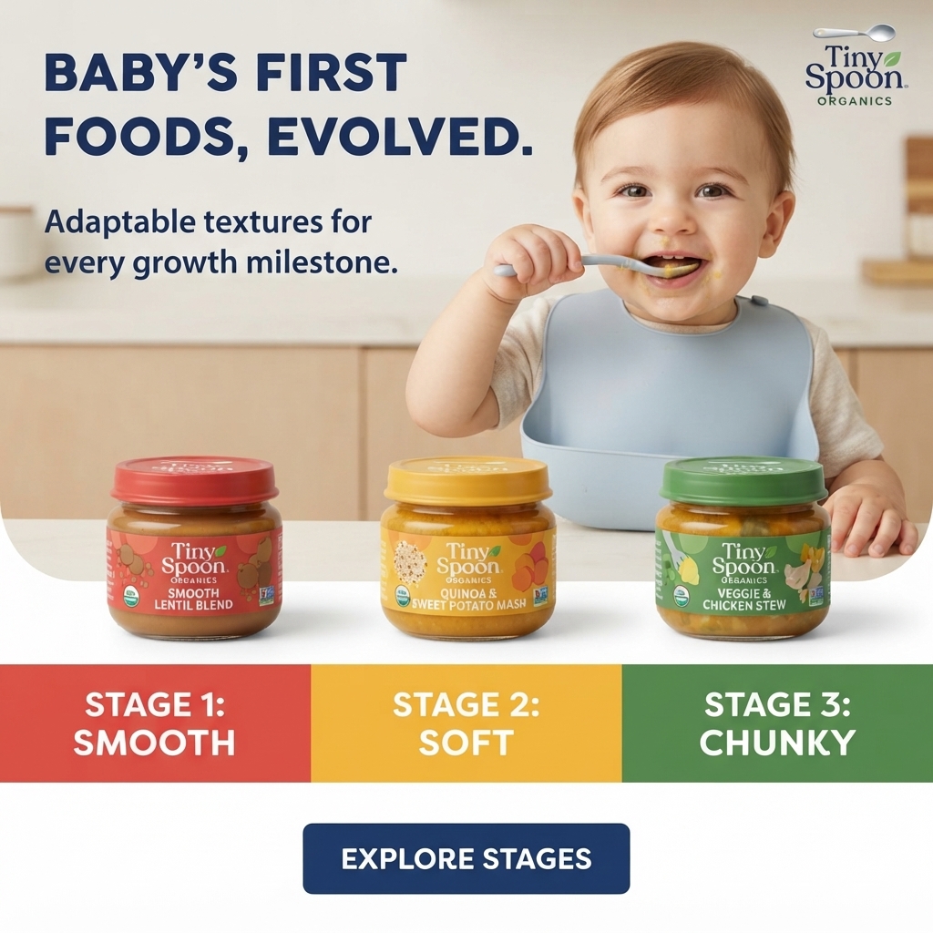
Lid, label and bar colours match, so parents instantly connect each jar to its texture stage.
- 02
Education reduces confusion
Many parents are unsure when to move to chunkier textures; the bars explain it in two words each.
- 03
Progress-focused headline
'Evolved' positions the brand as modern and growth-minded, not just another baby food.
- 04
Self-feeding baby shows milestones
A baby holding his own spoon visually reinforces the idea of growth and independence.
Full creative breakdown
Who this ad targets
This ad targets parents of babies from around four months up to toddlerhood who are planning the move from smooth purées to textured food. They want clear guidance and like brands that make choices easy. Organic and protein-rich options such as lentils, quinoa and chicken appeal to nutrition-aware parents. The clean, structured design suits busy shoppers who want quick answers rather than long explanations.
Copywriting analysis
The headline 'Baby's First Foods, Evolved.' implies the brand has improved on traditional baby food. The subline 'Adaptable textures for every growth milestone' explains how, and connects to developmental milestones that parents track. Stage labels reduce complex guidance to three words: Smooth, Soft, Chunky. Jar names add flavor and protein information. 'Explore Stages' is a logical CTA that sends parents to find the right stage. The copy is educational yet concise, guiding parents without overwhelming them with detailed feeding rules or charts.
Visual design
The layout stacks photo, jars, colour bars and CTA vertically for a clear reading order. Red, yellow and green bars create a bold traffic-light style progression. The beige kitchen and white counter keep the photo neutral so the jars stand out. Navy type for the headline and button provides strong, trustworthy contrast. The baby is placed centre-right, leaving room for the headline on the left.
How to adapt this template for your brand
- Show a happy baby in the top half with your headline beside them.
- Line up one product per stage across the counter.
- Add a full-width bar split into matching colour blocks.
- Label each block with the stage number and a one-word texture.
- Use a CTA that invites parents to find their stage.
Tips for baby food ads on Meta
On Meta, this educational format works well for cold audiences of new parents. Test a carousel where each card explains one stage in more depth. Use primary text to give rough age guidance for each stage. For Stories, stack the three bars vertically under the photo. Interest targeting around baby-led weaning and infant nutrition fits naturally here, as do new-parent life events.
About this creative
The top half is a bright lifestyle photo of a smiling baby in a light blue silicone bib, holding a spoon to his mouth at a white counter in a soft beige kitchen. A bold navy headline in the upper left reads 'Baby's First Foods, Evolved.' with a smaller line beneath, 'Adaptable textures for every growth milestone.' The Tiny Spoon Organics logo with a spoon and leaf sits top right. Three glass jars stand in a row on the counter, each with a matching lid and label: a red Smooth Lentil Blend, a yellow Quinoa & Sweet Potato Mash and a green Veggie & Chicken Stew, all with organic seals. Directly beneath, a full-width band splits into three coloured blocks in the same red, yellow and green, labelled 'Stage 1: Smooth', 'Stage 2: Soft' and 'Stage 3: Chunky' in white capitals. Below on white, a navy rectangular button says 'Explore Stages'. The design is clear, structured and educational.
Meta ad · 1200 × 1200 · Baby Food
Baby Food Stages Ad: Smooth, Soft, Chunky Comparison
This Tiny Spoon Organics ad explains texture stages at a glance. Three jars sit above colour-coded bars for Stage 1 Smooth, Stage 2 Soft and Stage 3 Chunky, while a happy baby feeds himself behind them. A bold headline and clear button make it a strong comparison template for stage-based ranges.
Added
All brand names and logos are property of their owners. Adplaylist is not affiliated with or endorsed by these brands.
Details
Ad copy
Primary text
Baby's first foods, evolved. Tiny Spoon Organics jars come in adaptable textures for every growth milestone: Stage 1 Smooth Lentil Blend, Stage 2 Soft Quinoa & Sweet Potato Mash and Stage 3 Chunky Veggie & Chicken Stew. Explore the stages.
Description
Organic jars with textures for every growth stage.
On-image text
BABY'S FIRST FOODS, EVOLVED. | Adaptable textures for every growth milestone. | Tiny Spoon Organics | Tiny Spoon Organics Smooth Lentil Blend | Tiny Spoon Organics Quinoa & Sweet Potato Mash | Tiny Spoon Organics Veggie & Chicken Stew | STAGE 1: SMOOTH | STAGE 2: SOFT | STAGE 3: CHUNKY | EXPLORE STAGES
Headline ideas for this template
- 1Smooth, soft, chunky: find their stage
- 2Textures that grow with your baby
- 3First foods for every milestone
- 4Organic jars from first taste to first chunks
- 5Know exactly which stage is next
Meta image ad specs
| Placement | Ratio | Size (px) |
|---|---|---|
| Feed | 1:1 or 4:5 | 1080×1080 / 1080×1350 |
| Marketplace | 1:1 | 1200×1200 |
| Messenger inbox | 1:1 | 1200×1200 |
| Stories & Reels | 9:16 | 1080×1920 |
This template is 1:1. Request 4:5 or 9:16 to cover all placements.
Browse similar by tag