Key takeaways
- Format: Comparison story: two product options over a photo grid with a deadline.
- Best for: Upselling from single tickets to passes, memberships or bundles.
- Hook: 'One day or all year' makes the upgrade decision feel simple.
- Reuse it: Show both products as visual tickets and frame the choice in four words.
Available sizes
What is a comparison ad?
A comparison ad sets the product against an alternative, such as a competitor, the old way of doing things or a cheaper option, usually in a two-column layout or table. It helps buyers who are already weighing options see quickly why this one is the better choice.
See all comparison ads →Why this comparison ad works
- 01
Choice instead of push
Offering two options lets buyers pick their commitment level, while the all-year card anchors value.
- 02
Products made tangible
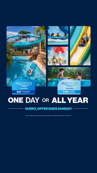
Ticket and card graphics turn abstract passes into physical-looking products people can picture holding.
- 03
Variety in one view
The photo grid shows slides, rivers, splash zones and animals, proving there is enough to justify returning.
- 04
Hard deadline
'Offer ends Sunday' gives a short, specific window that drives faster decisions.
Full creative breakdown
Who this ad targets
The ad targets Central Florida residents and families planning Orlando trips, including tourists who might visit once and locals who could return all summer. Parents with kids aged roughly 5 to 15, teens and young adults are core segments. The Fun Card option particularly speaks to locals and repeat visitors who would benefit from unlimited visits, while the Day Ticket serves vacationers on a tight schedule.
Copywriting analysis
The headline 'One day or all year' is a clean either-or that frames the purchase around time rather than price, which makes the Fun Card feel like obvious value. Shrinking 'or' between the bold options keeps the eye on the contrast. The urgency line, 'Hurry, offer ends Sunday!', adds a specific deadline that works better than vague 'limited time' language. Product names on the ticket graphics do the descriptive work. Legal copy is kept to a single small line, protecting the brand without cluttering the message. Showing a price or saving would strengthen the comparison for price-led buyers.
Visual design
Navy gives a deep, premium backdrop that makes the bright blue water photos glow. Rounded grid tiles feel modern and app-like. The two ticket graphics overlap the photos to bridge experience and product. Large white condensed headline type is easy to read on mobile, and the light-blue deadline banner with thin rules adds a subtle secondary layer. Generous space at the top and bottom respects Story safe zones.
How to adapt this template for your brand
- Collect four to six photos showing the variety of your experience.
- Arrange them in a rounded grid on a dark brand-color background.
- Design simple ticket or card graphics for each product option.
- Write a short either-or headline that contrasts the options.
- Add a specific deadline and a single line of legal copy.
Tips for water parks ads on Meta
Use this 9:16 creative in Instagram and Facebook Stories and Reels, keeping the headline in the middle third. Run it in the final days of a sale to make the 'ends Sunday' message true and urgent. Split audiences: locals for the Fun Card angle, travelers to Orlando for Day Tickets. Add a 'Buy tickets' CTA and a price comparison in the primary text. Refresh creative after the deadline.
About this creative
This 9:16 ad uses a dark navy background with a rounded-corner photo grid in the upper half. The large left image shows a tall teal spiral slide tower and a lazy river with guests floating on tubes under a blue Florida sky. Four smaller images on the right show a group on a raft, kids playing under a splash feature, a rider on a yellow and teal slide, and a boy on a tube near an animal habitat. Overlapping the bottom of the grid are two ticket graphics: an 'Aquatica Orlando Day Ticket' with a blue strip, and an 'Aquatica Orlando Fun Card' with a teal strip. Below, large white type reads 'ONE DAY OR ALL YEAR', with 'or' in smaller type. A thin-lined banner beneath says 'HURRY, OFFER ENDS SUNDAY!' in light blue, and tiny legal text covers taxes, blockout dates, fees and restrictions.
Meta ad · 338 × 600 · Water Parks
Aquatica Orlando Ad: One Day or All Year Ticket Comparison
This vertical Story ad from Aquatica Orlando lets people choose between a single Day Ticket and an all-year Fun Card. A five-photo grid of slides, lazy rivers and family moments sits above two product tickets and a 'One day or all year' headline with a Sunday deadline. Use it for product comparisons and upsell offers.
Added
All brand names and logos are property of their owners. Adplaylist is not affiliated with or endorsed by these brands.
Details
Ad copy
Primary text
Visit once or splash all year long: pick a Day Ticket or upgrade to the Fun Card at Aquatica Orlando. Hurry, this offer ends Sunday!
Description
Day Ticket or Fun Card – offer ends Sunday
On-image text
AQUATICA ORLANDO DAY TICKET | AQUATICA ORLANDO FUN CARD | ONE DAY OR ALL YEAR | HURRY, OFFER ENDS SUNDAY! | Taxes, blockout dates, service fees, and other restrictions may apply. ©United Parks & Resorts, Inc.
Headline ideas for this template
- 1Splash once or all season long
- 2Day trip or all-year fun? You choose
- 3Why visit once when you can come back all year?
- 4Your summer, your ticket
- 5Last chance: Aquatica deals end Sunday
Meta image ad specs
| Placement | Ratio | Size (px) |
|---|---|---|
| Feed | 1:1 or 4:5 | 1080×1080 / 1080×1350 |
| Marketplace | 1:1 | 1200×1200 |
| Messenger inbox | 1:1 | 1200×1200 |
| Stories & Reels | 9:16 | 1080×1920 |
This template is 1:1. Request 4:5 or 9:16 to cover all placements.